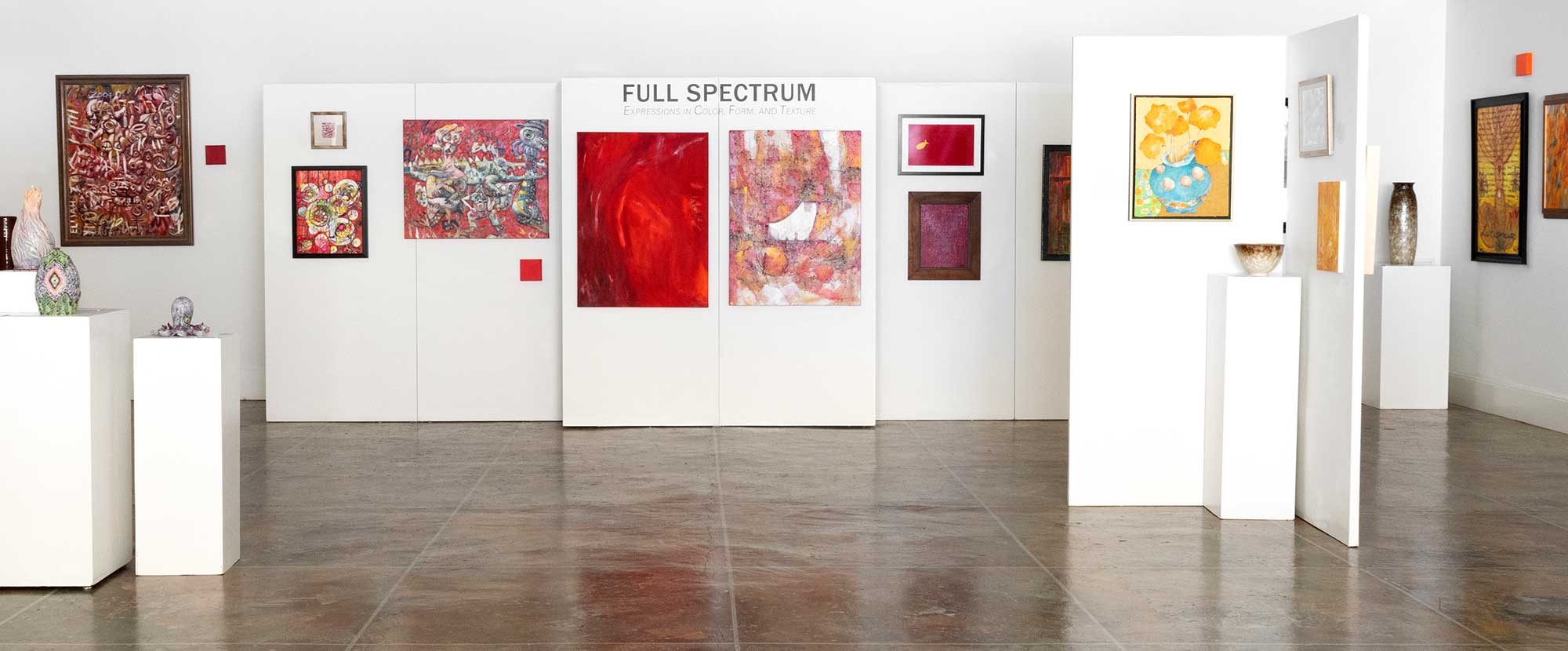
Blue Ridge Fine Arts Guild
Full Spectrum: Expressions in Color, Form and Texture
September 26 – October 31, 2020
Exhibiting Artists:
Click artists’ names for biographies
Carol Bailey
Anne Bessac
Anita Blackwell
Debra Carpenter
WJ Cunningham
Claudia Dunaway
Bridget Fox
Susan Garriques
Donna Griffin
Ken Hillberry
Charlotte Holland
Julie Kostes
Tom Kostes
Alan Larkins
Judith Larkins
Laurel Lovrek
Dennis McAvoy
Katherine McCarty
Rhea Ormond
Gaylene Petcu
Michael Rutkowsky
Ruth Fischer Rutkowsky
Anne Sabri
Loretta Schaffert
Jenny Lou Sherburne
Rick Shimer
Kat Turczyn
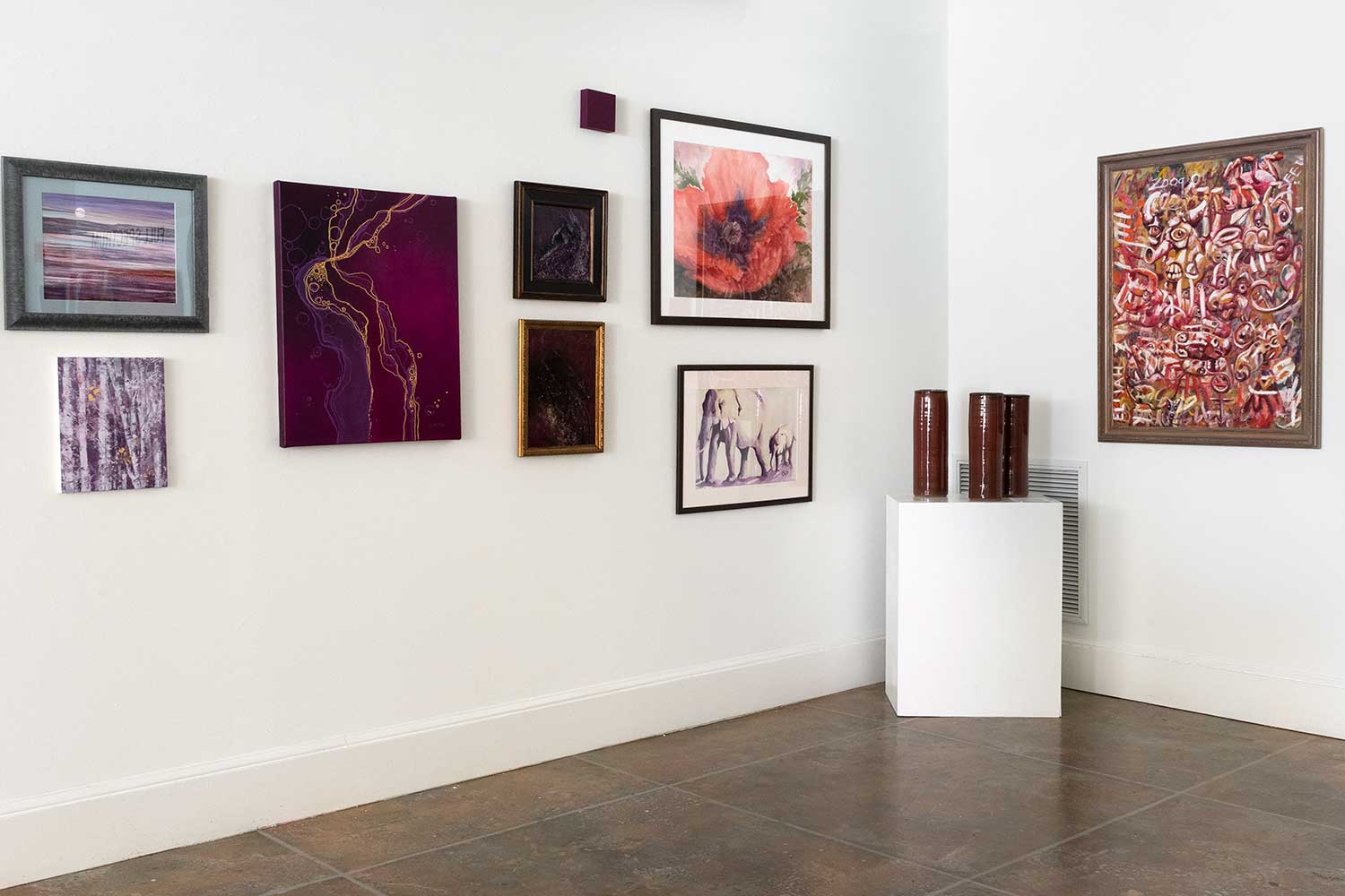
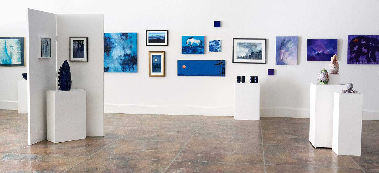
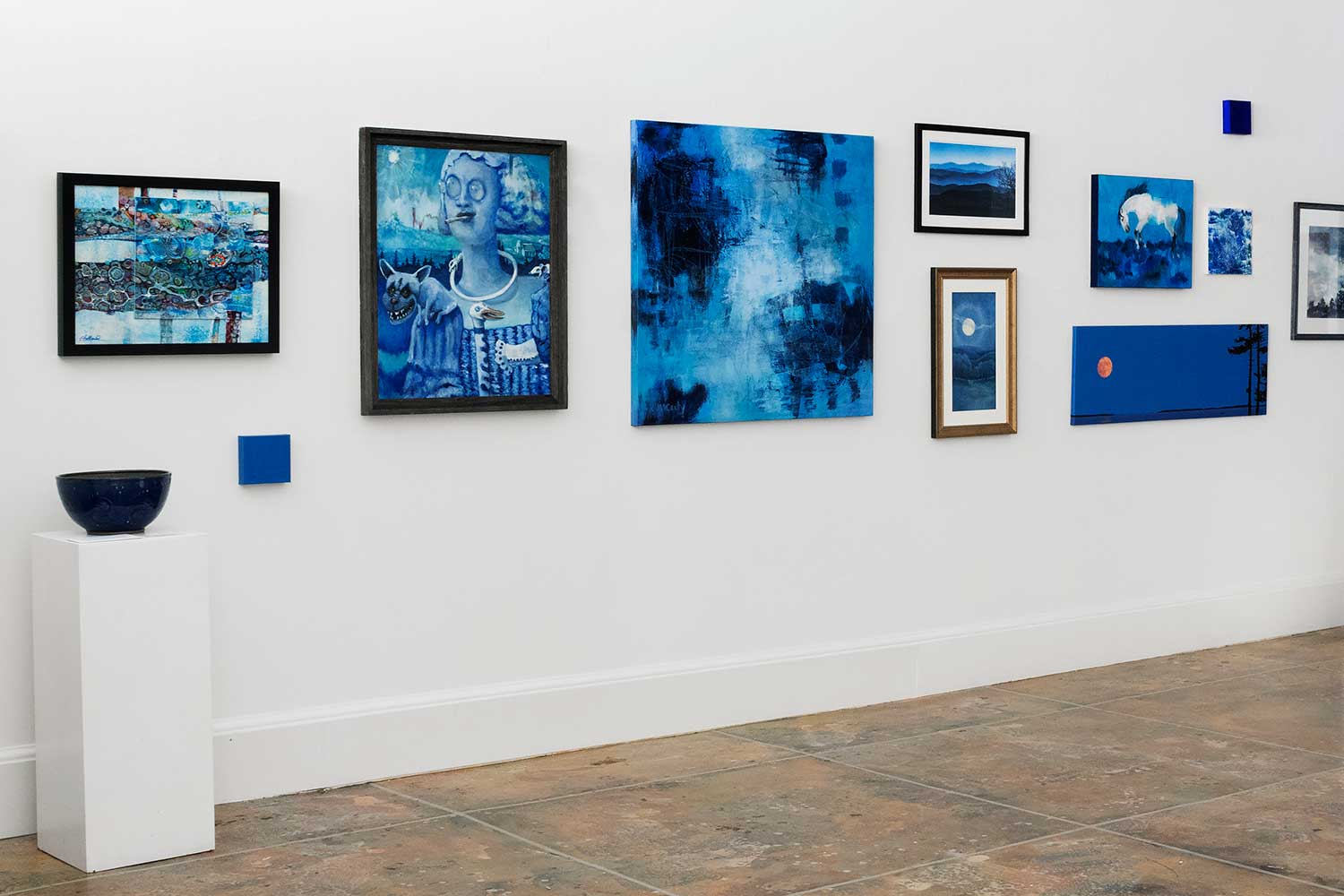
Full Spectrum: Expressions in Color, Form and Texture, an exhibition of works by members of the Blue Ridge Fine Arts Guild (BRAG) and invited potters will be at our Spruce Pine gallery from September 26 through October 31.
The group creates a visually engaging experience using color, form and texture. The full spectrum of color spans the gallery so that visitors standing within it are encompassed by a colorful flow. The artists explore the themes of exuberance, radiance, introspection and tranquility as a reflection of the ever-flowing spectrum of life.
Works in a variety of media—oil, watercolor, acrylic, cold wax, pastel, photography, printmaking and clay—will be accompanied by artist statements relating the work to the theme of the exhibition, and giving insight into the artists’ inspiration, creative processes and techniques.
BRAG was formed in 2008 in order to bring together area artists working in any two-dimensional medium. Members meet monthly and new members are always welcome. Interest in the fine arts is encouraged through member exhibitions, demonstrations by guest artists, outdoor painting events and community involvement. For more information, visit bragwnc.com.
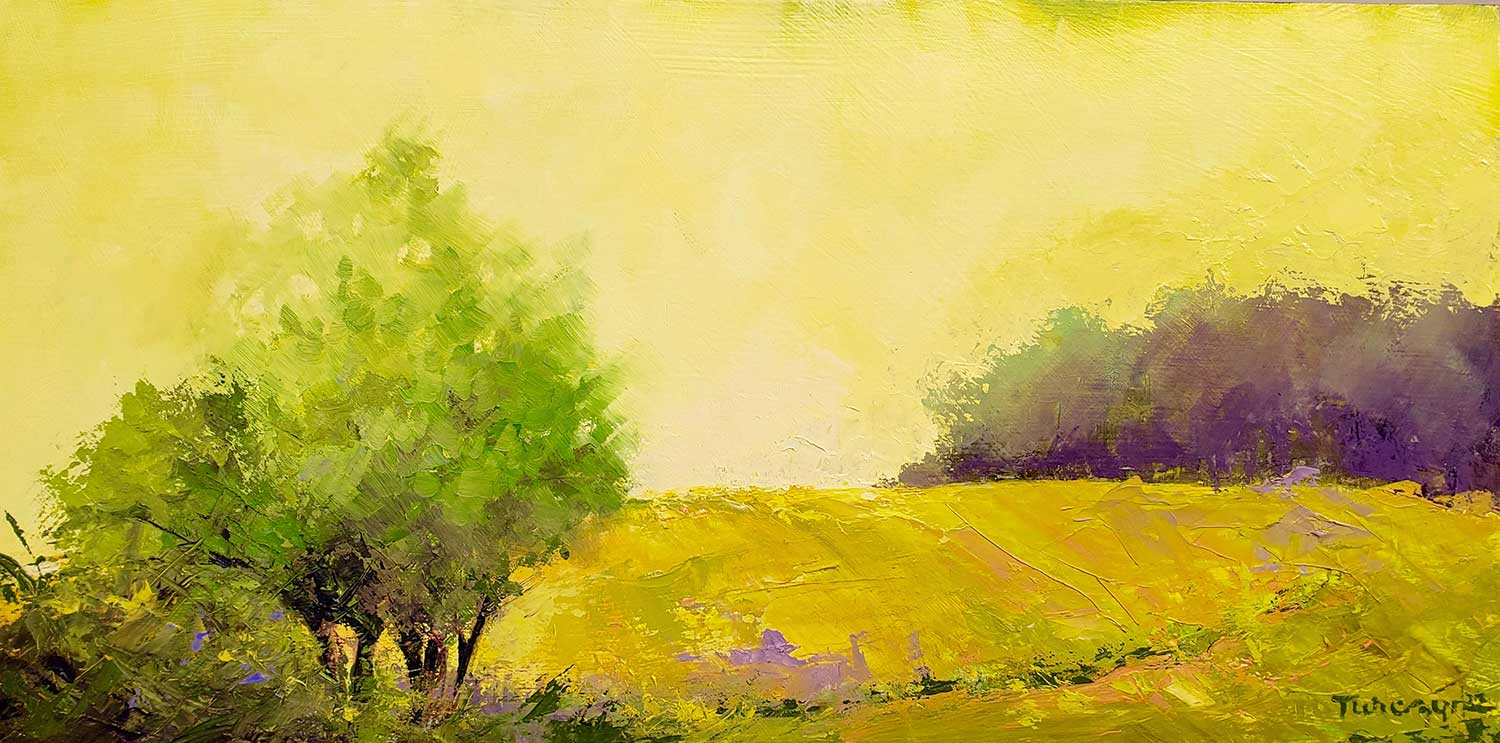
Artist and BRAG member Kat Turczyn describes her inspiration:
The color violet, one of my favorite colors, inspired me to create Tempest in Amethyst using several shades and combinations of red and blue. This year has been my year for focused but playful experimentation, and this painting, almost entirely violet, shows part of my process. I see mountains whipped by weather, but with a slight shift in viewpoint, it’s ocean waves in a storm.
For more information about the Blue Ridge Fine Arts Guild, visit bragwnc.com or follow them on Facebook.
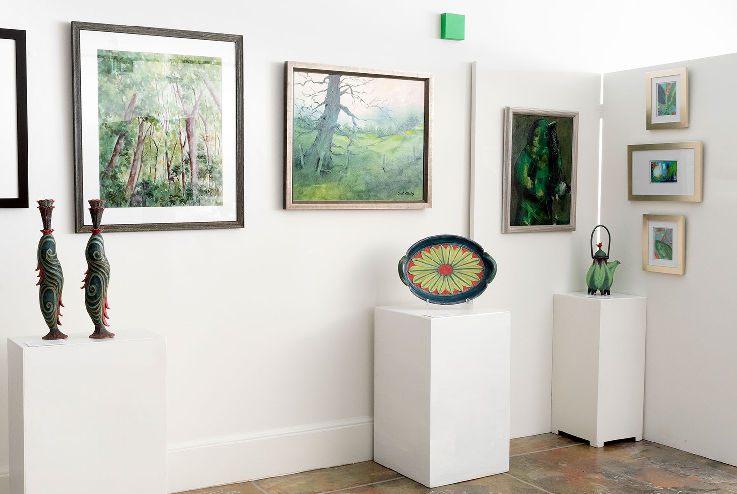
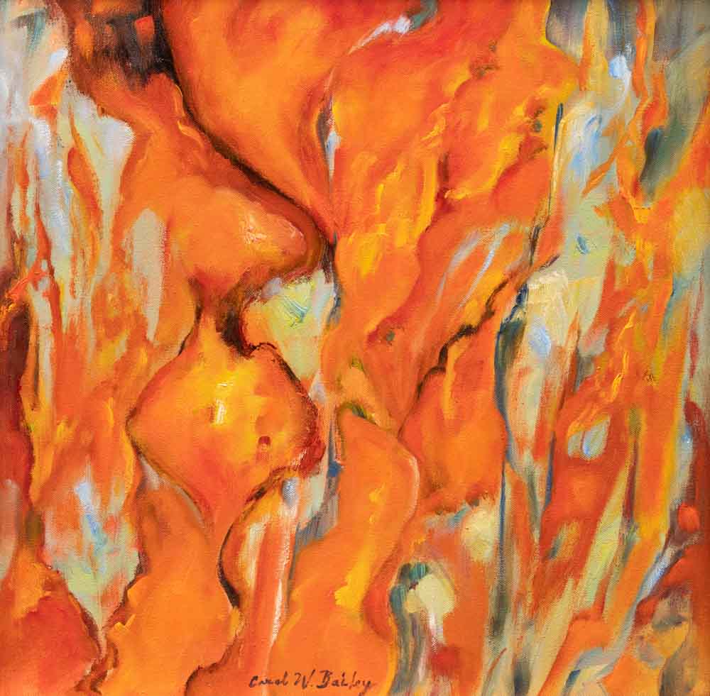
Denial I
Carol Bailey
Oil on canvas
24H x 18W in
Denial II
Carol Bailey
Oil on canvas
18H x 18W in
Settling on an exploration of orange, a color I typically use very sparingly, I was obsessed by images of uncontrolled wildfires and startling environmental disasters. Denial I exhibits an almost blossom-like quality to the composition. While Denial I emphasizes a somewhat lateral progression of movement, Denial II exhibits more entrenchment in shape and composition, a surrender to the blazing denial of environmental reality.
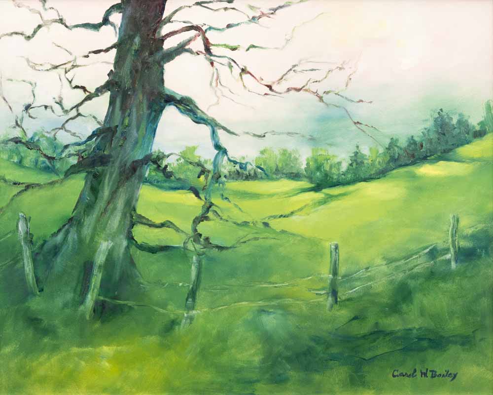
Another Rainy Spring
Carol Bailey
Oil on canvas
24H x 30W in
Another Rainy Spring is a spontaneous, but contemplative, response to current life conditions and an “a la prima” composition emphasizing the color green. Running out to the studio in pouring rain, I spent several hours there experimenting and exploring green and its descriptive qualities. This painting feels deceptively simple yet it holds great meaning to me.
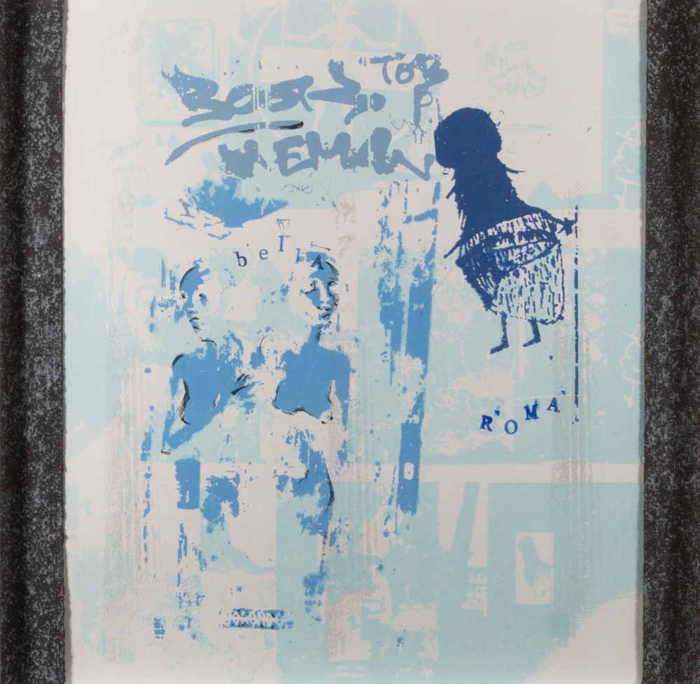
The Ladies of Roma
Anne Bessac
Silkscreen
12H x 12W in
In 2014 Anne lived in Rome for 10 weeks. She roamed its streets, drew its monuments and collected graffiti images in her iPhone. She has collaged these photos into her visual response to Rome as a series of silkscreen prints. The prints capture Rome’s spirit that Anne saw first in FURLA’s ad which proclaimed “CREATIVITY SPEAKS ITALIAN!”
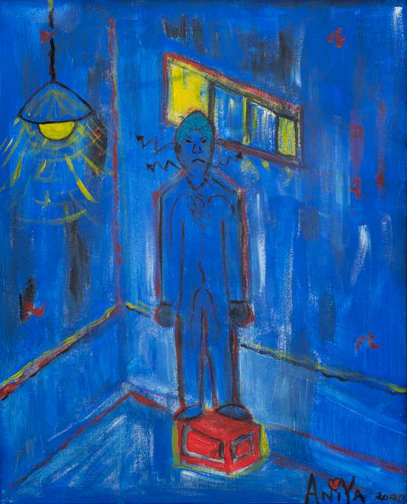
After the Stroke
Anita Blackwell
Acrylic on canvas
20H x 16W in
Inspired by my husband’s sudden stroke at age 58 years old.
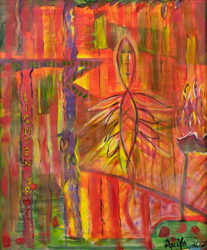
Lighten Up
Anita Blackwell
Acrylic on canvas
24H x 20W in
Inspired by my angel and guide, Guildha reminding me to lighten up.
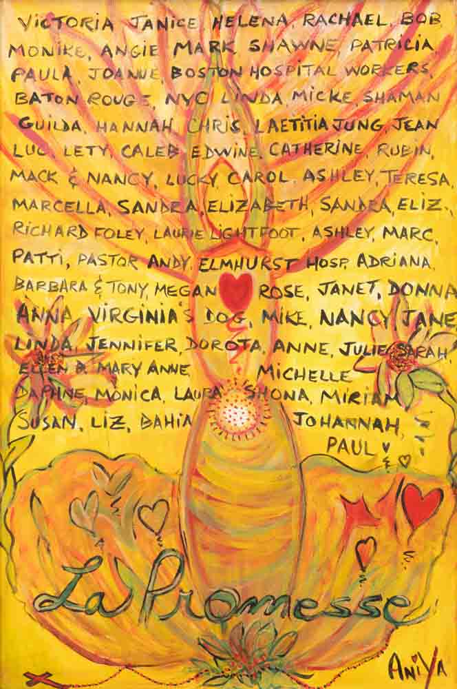
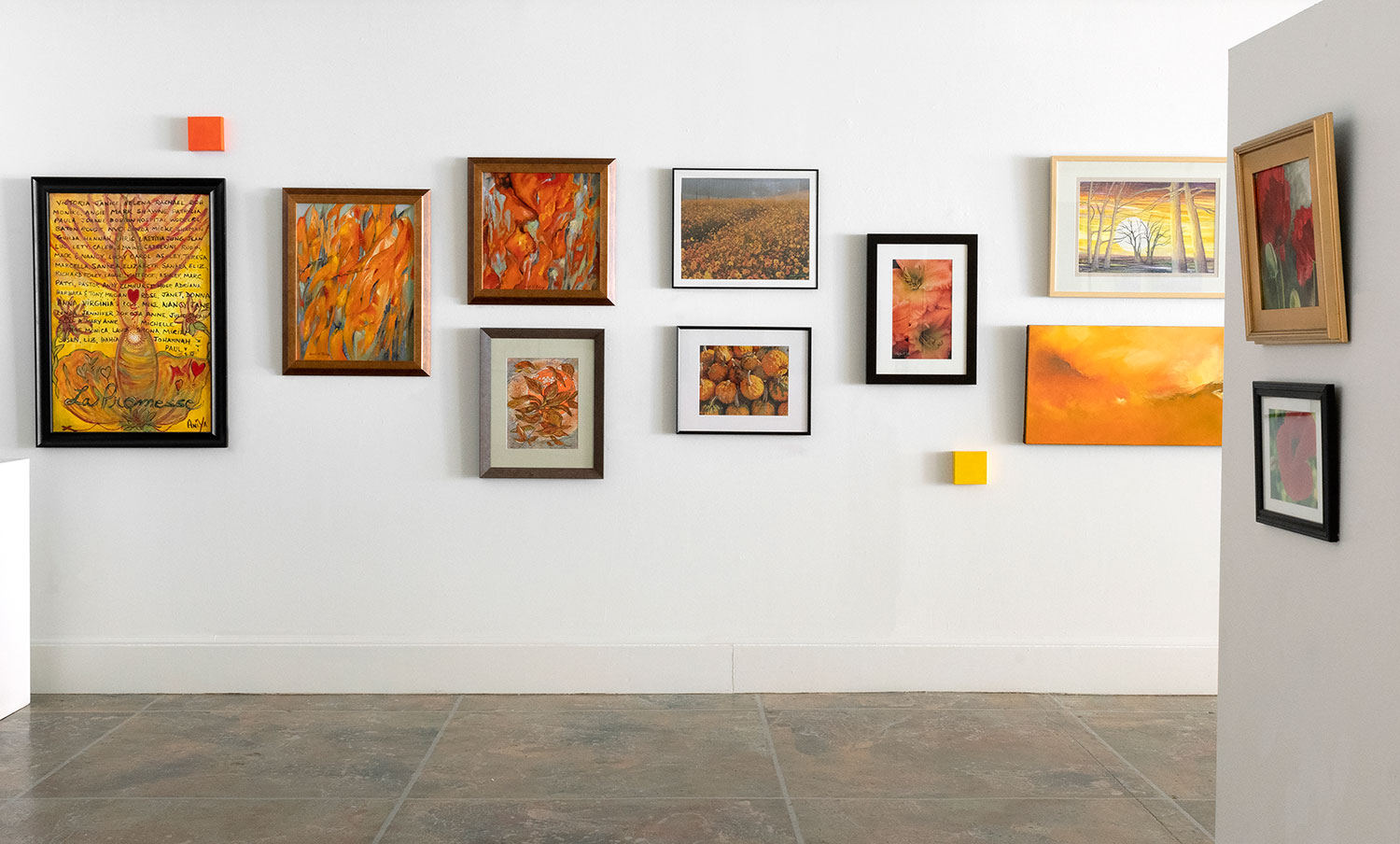
La Promesse
Anita Blackwell
Acrylic on canvas
36H x 24W in
During the early COVID days I was part of a rosary prayer group sending prayers out all over the world.
See U/See Me
Debra Carpenter
Oil on canvas
40H x 30W in
As with all my paintings they start out as a letter. What shows up is a subconscious depiction. The colors are what ever there is on the palette. This is Reds.
After While Crocodile
Debra Carpenter
Oil on canvas
24H x 36W in
The red here was deliberate to push the characters forward.
Epilogue
Debra Carpenter
Oil on canvas
30H x 24W in
I chose the blues for this, giving a dream like/ethereal feel. The final chapter begins here.
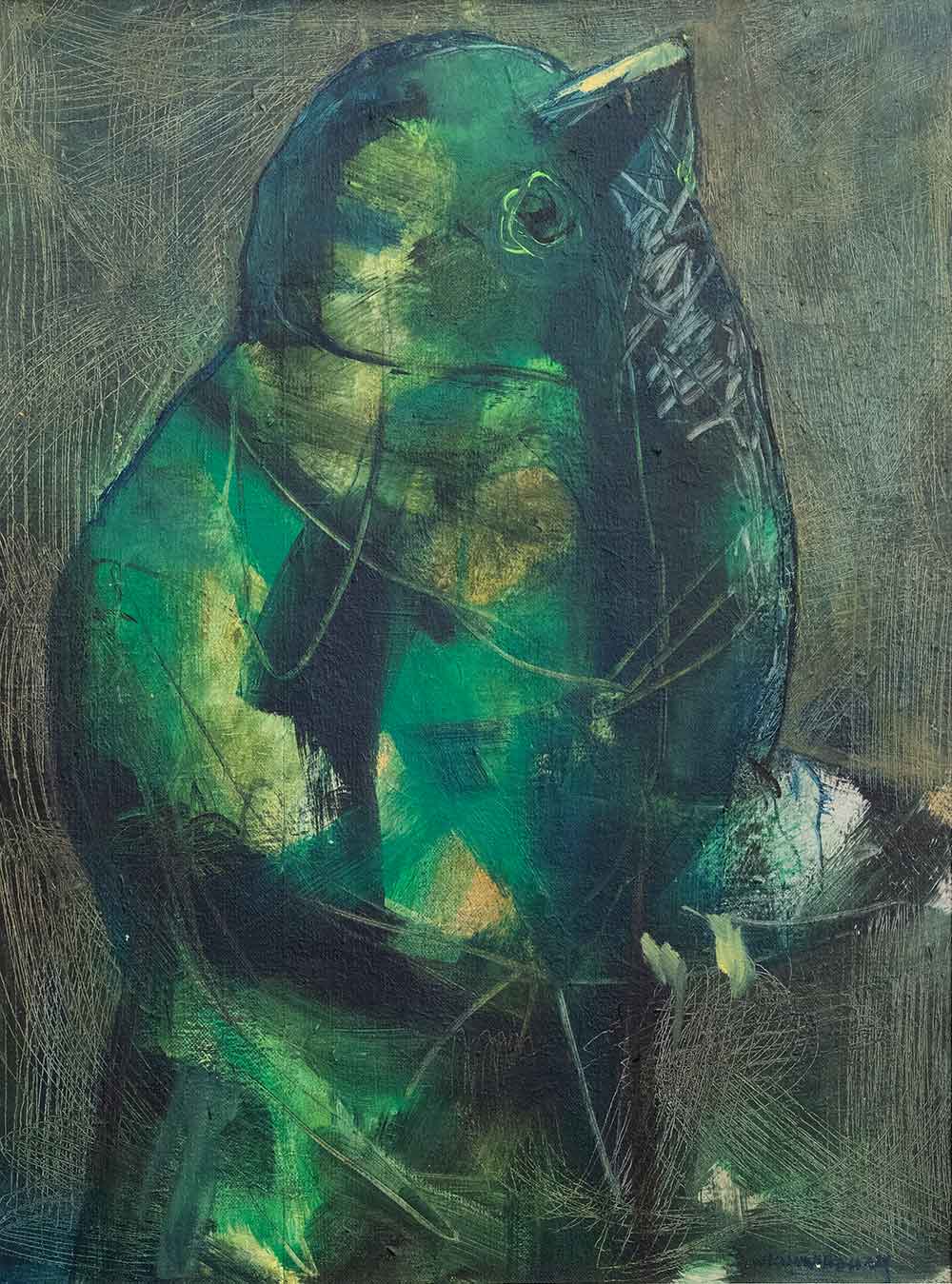
Green Bird
WJ Cunningham
Acrylic on canvas
24H x 18W in
Using a color that I rarely use, I wanted to create the image of a bird. I have abstracted the subject and added texture to enhance the image.
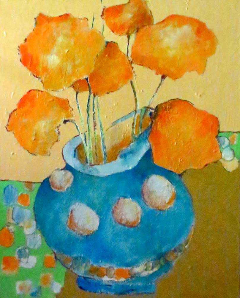
Orange Blossoms
WJ Cunningham
Acrylic on canvas
20H x 16W in
I went back to my Impressionistic phase to create this image. I wanted to keep it bright and lively. I used simple shapes to create a placement that will lead your eye around and around the format.
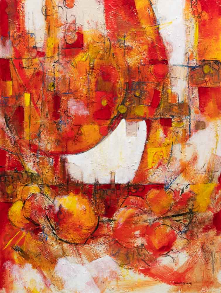
Sunlit Table
WJ Cunningham
Acrylic on canvas
40H x 30W in
Working with red is difficult as I find it often rather flat. As the painting progressed I could envision a sun beating through a window on a table filled with fruit.
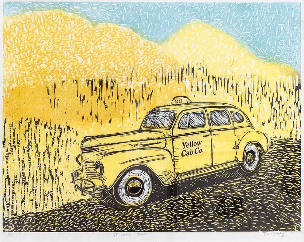
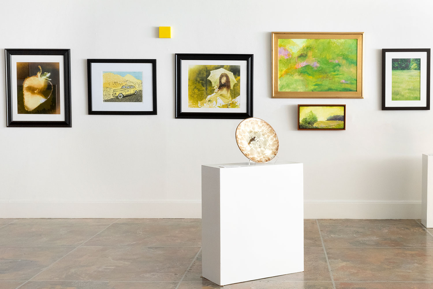
Yellow Cab
Claudia Dunaway
Woodblock print, akua liquid pigment and intaglio ink on BFK paper
18H x 24W in
Initially the color yellow brought to mind sunshine, lemon drops, and daffodils, then with current events those ideas began to fade. We watch a lot of old movies set in New York City that include the iconic Yellow Cab in the scenes. I began to yearn to travel, but soon realized I was lost in the woods just like the cab with no GPS.
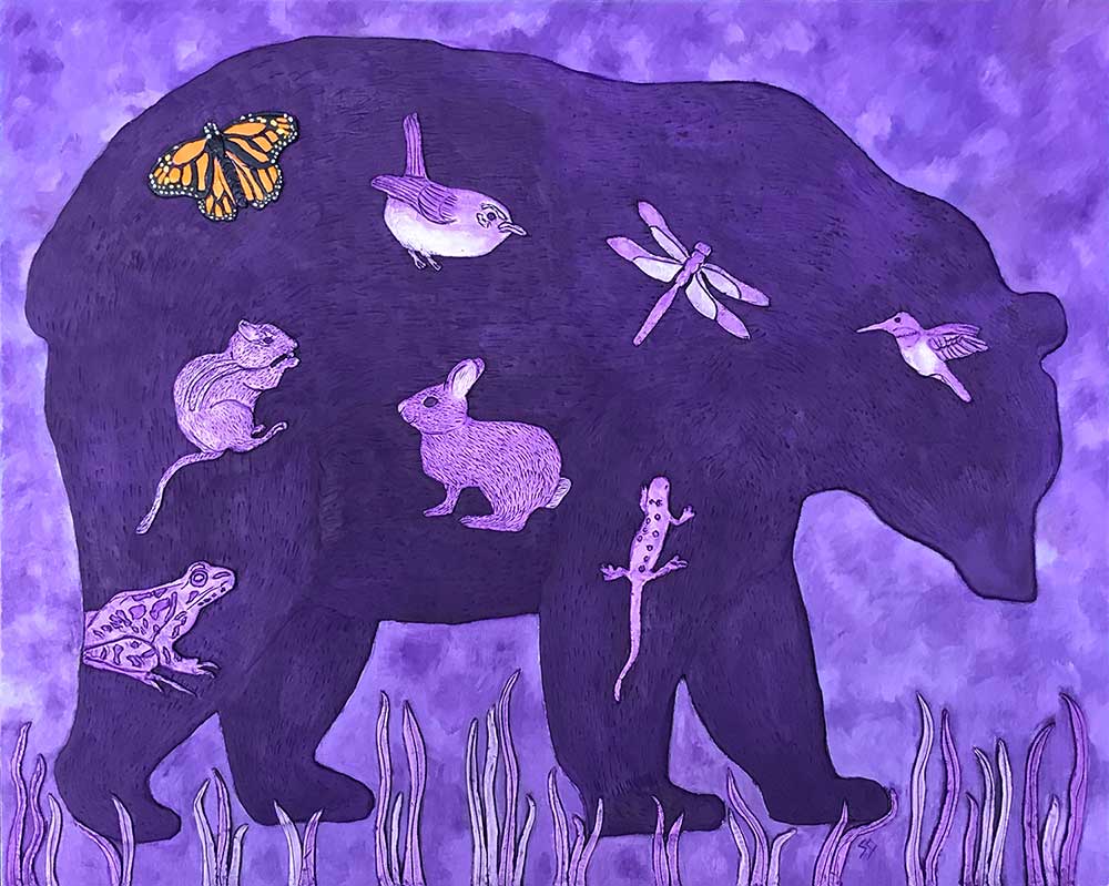
Mama Bear
Susan Garriques
Paper clay, oil, acrylic on cradled board
24H x 30W in
Purple – signifying power – is perfect for this Mama Bear – a powerful animal. She is the queen of the forest animals. The Monarch Butterfly – in its orange splendor – is a symbol of hope – for both the Monarch’s survival and the survival of our planet.

Out of the Blue
Susan Garriques
Oil on canvas
16H x 20W in
Blue, nature’s color for the sea and the sky, is often associated with trust, stability and peace. The horse – appearing to be bucking “just because” – doesn’t seem stable or peaceful and perhaps not trustworthy. A juxtaposition that causes tension and creates interest.
Pollinators’ Path
Donna Griffin
Acrylic on canvas board
16H x 12W in
I love caring for the pollinators in my garden. When I moved here last autumn, I had no idea how many hummingbirds there were here! Pollinators’ Path illustrates my vision for my future hummingbird garden.
Jungle Blues
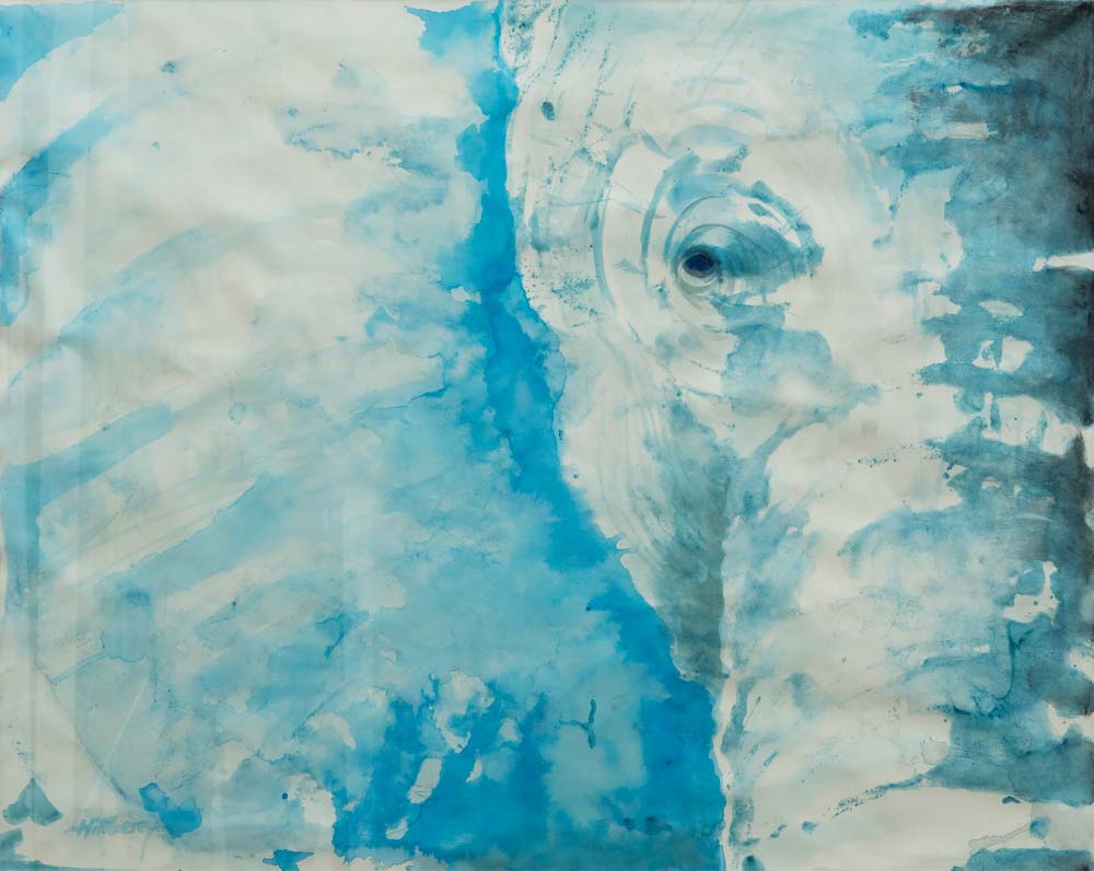
Ken Hillberry
Monoprint
28H x 36W in
Looking through their eyes, a watercolor statement for the endangered species all around the globe. The African Elephant emulates a docile and sentient intelligence.
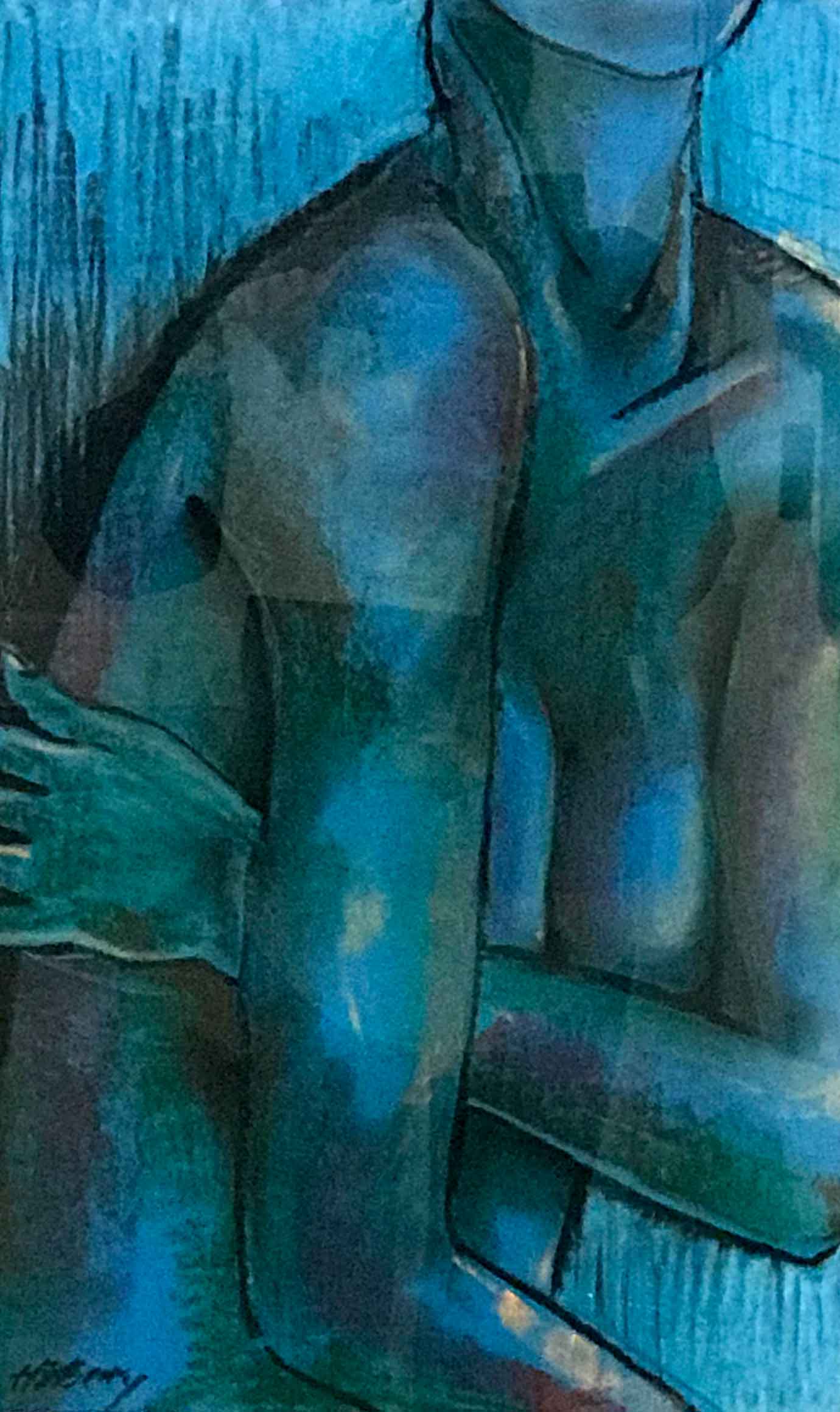
Blue Nude
Ken Hillberry
Pastel
29.5H x 20W in
The human figure presents the ideal source for artistic study, coupled with the color blue, envisioning qualities of depth and stability depicting a metabolic calming effect.
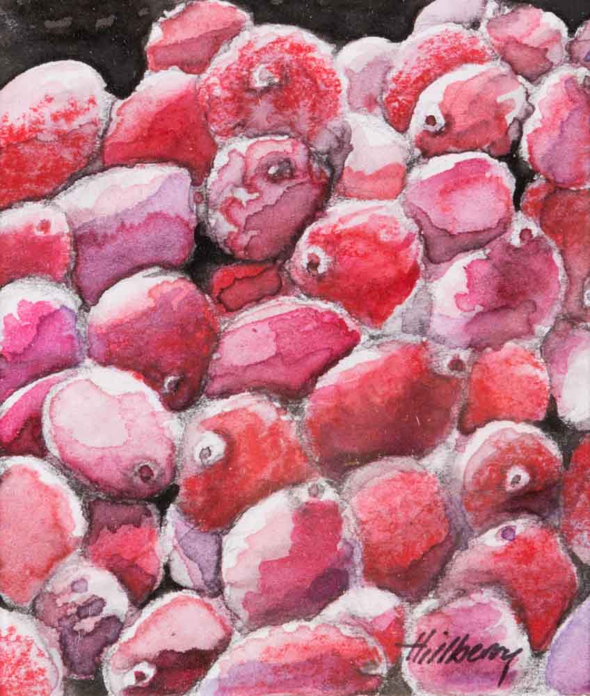
Cranberry Stack
Ken Hillberry
Watercolor
7.5H x 7W in
The color red is warm, positive that’s associated with most physical needs, a will to survive, energizing as it promotes ambition and determination.
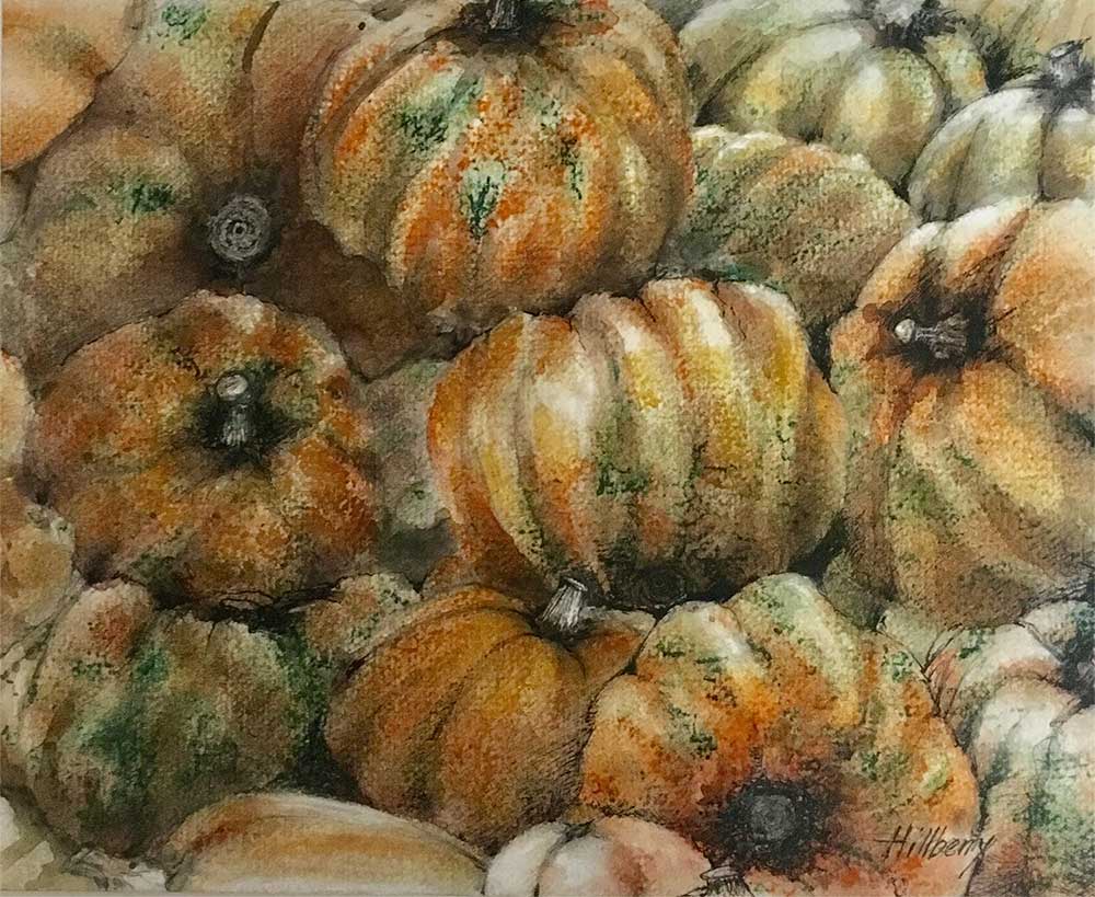
Jack-O-Lanterns
Ken Hillberry
Mixed media
11H x 14W in
The color orange, as the painting, depicts a blend of techniques and feeling of joy and creativity promoting a sense of general wellness and emotional stability.
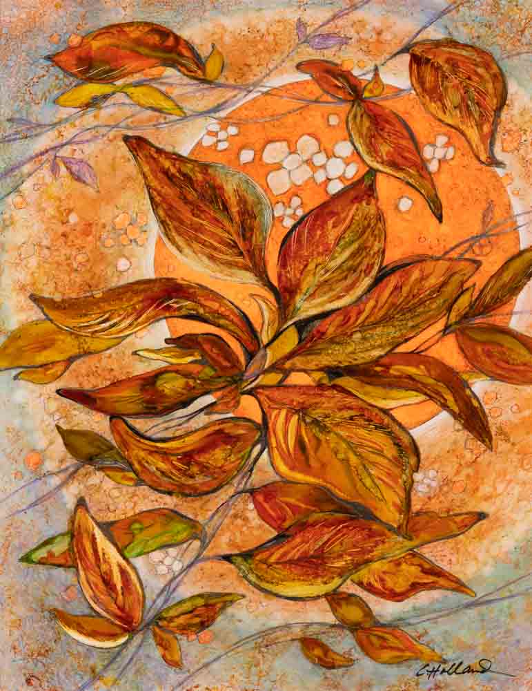
Autumn Glow
Charlotte Holland
Mixed media
14H x 11W in
Orange is known as a cheerful color and represents a positive outlook on life. Last fall, I was looking at the sky through colorful tree branches and that image stayed in my mind. I attempted to capture in this painting the feeling of warmth and contentment in that moment.
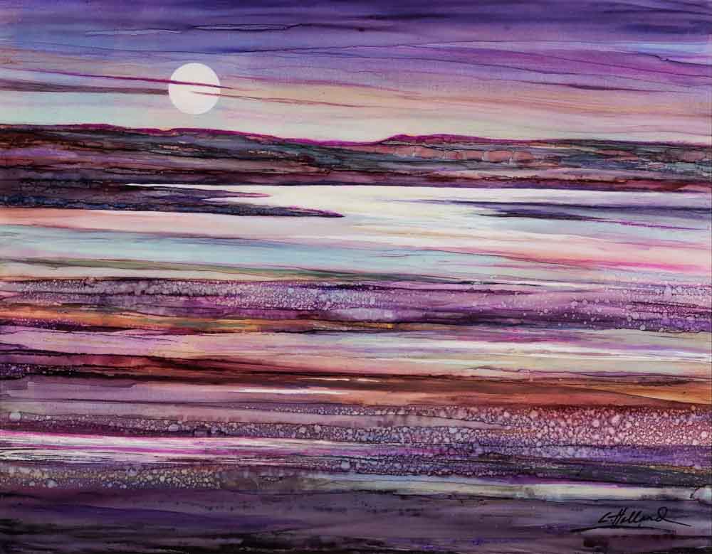
Moonlight Becomes You
Charlotte Holland
Mixed media
11H x 14W in
Purple is a color that is introspective and stimulates the imagination. I have only used it in a limited way in my paintings, so I chose the challenge of composing a primarily purple painting. I wanted to express a dreamlike quality. It took several attempts to get a satisfactory combination of “purples”. It was a learning experience!
Illuminated
Charlotte Holland
Mixed media
14H x 21W in
Yellow is the most visible color and therefore is attention-getting. In a painting, it is often used to draw attention to an object or an area. Yellow has a very limited range from light to dark, which presents a challenge. Variation and interest in the composition must be developed using other techniques.
Peace Like a River
Charlotte Holland
Mixed media
16H x 20W in
Blue is a fun and reliable color with which to paint because it has such a dramatic range from light to dark. It can represent spirituality and it symbolizes friendship and calmness. I wanted to work with it in an abstract manner and convey a feeling of peaceful interrelationships.
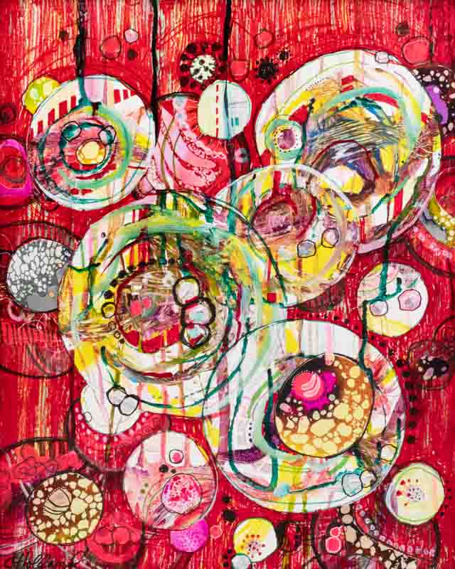
Going Viral
Charlotte Holland
Mixed media
20H x 16W in
Before the pandemic, I had started this abstract painting using circular shapes in the composition. I revisited it in a tongue-in-cheek approach as the idea emerged of the floating parasitic viruses coming at us. The use of bold red symbolizes danger, as well as anger and other strong emotions.
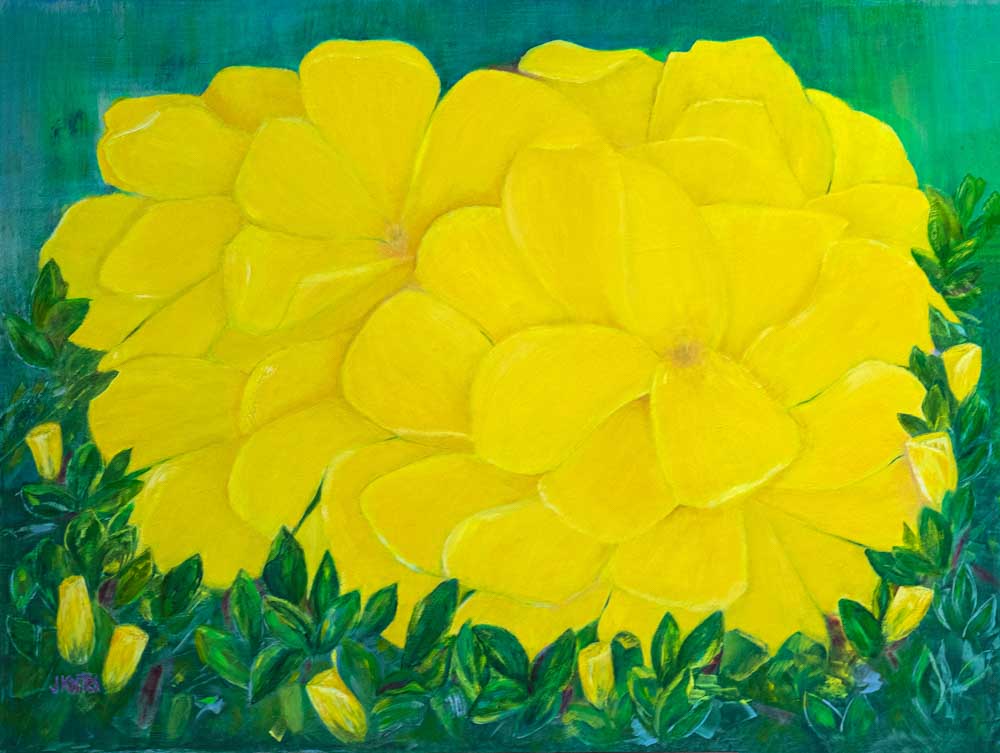
Yellow Rose
Julie Kostes
Oil on wood panel
18H x 24W in
In choosing yellow for my color: the rose presented itself without hesitation: exuberant, and joyful, yet delicate and graceful. Its fragrance and beauty are a gift to be treasured.
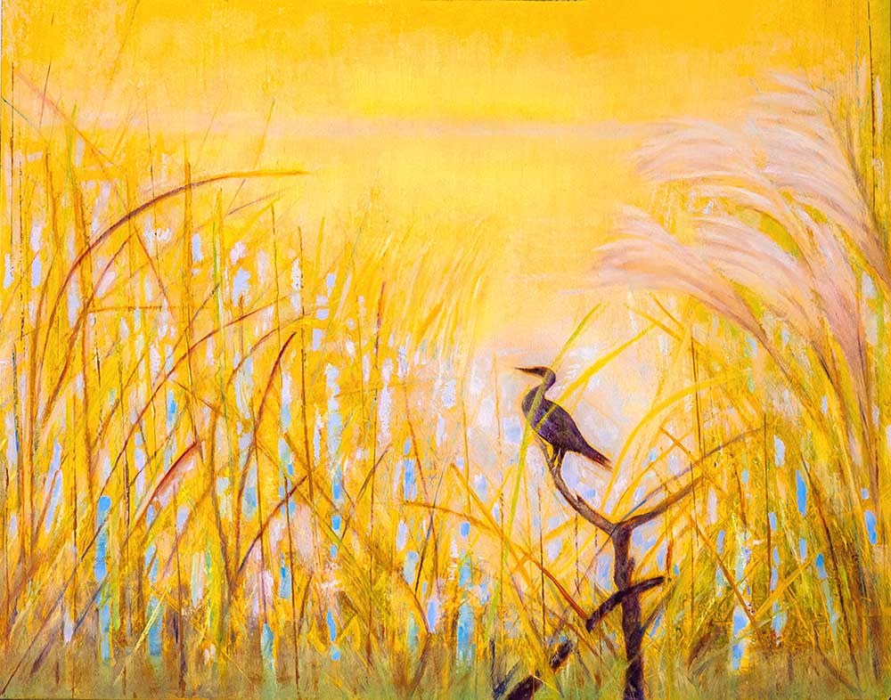
Repose
Julie Kostes
Oil on wood panel
11H x 14W in
What attracted me to this setting was the quiet tranquility of the bird, in its natural environment of water and grasses.
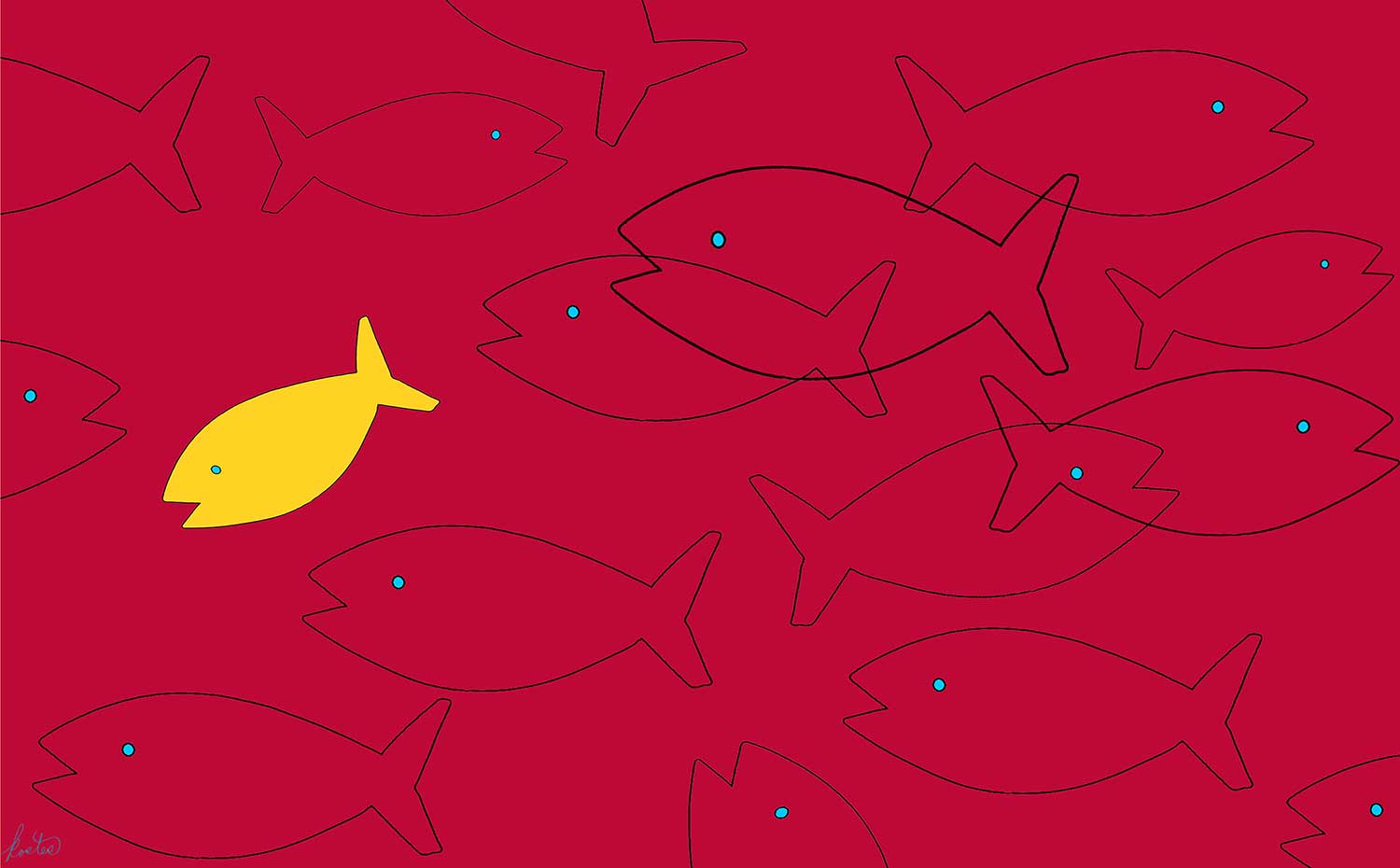
The Happy Fish
Tom Kostes
Archival ink print
9.5H x 15.5W in
This was a journey from capture in camera to final image. The original fish was an old, primitive, wood carving of a cod fish, which I photographed, brought to the computer, captured the silhouette and then laid out the design. I then added the colors. So it’s a combination of imagination, camera, and digital art.
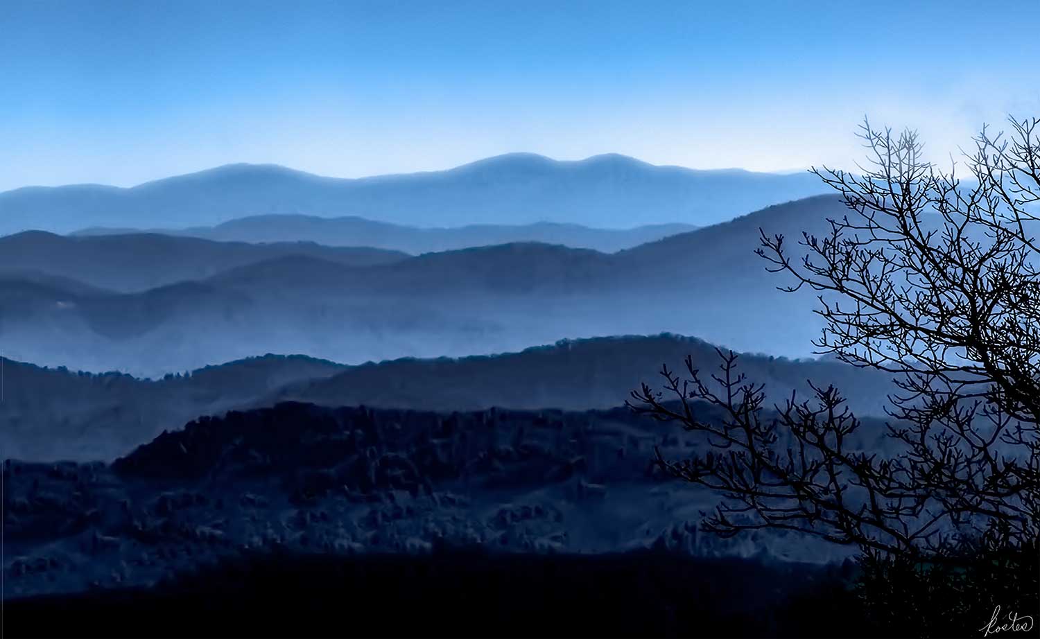
Blue Ridge Mountains – Morning Mist
Tom Kostes
Archival ink print
9.5H x 15.5W in
This is a rather iconic view of the Blue Ridge Mountains in the early morning up on the Parkway. There are eight layers of hills, that each get mistier as they recede into the distance. Although they have been painted and photographed many times, they still capture the imagination, plus the variation of blues is always lovely.
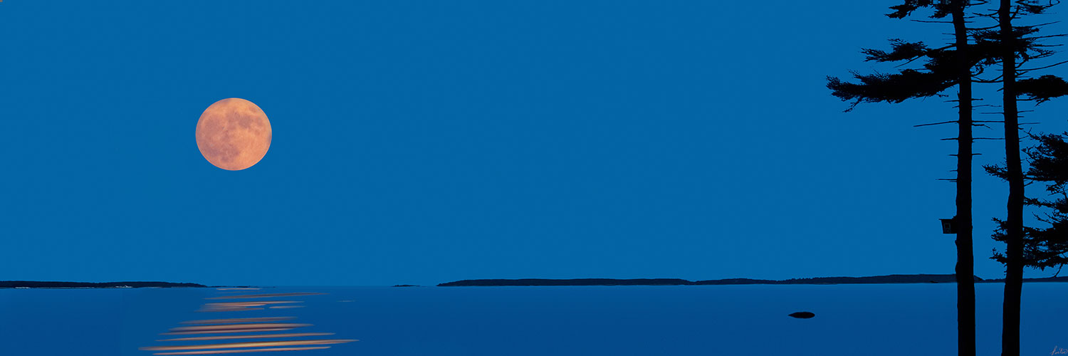
Moonrise Over the Water
Tom Kostes
Giclee print on canvas
14H x 42W in
It’s the “Blue Hour,” shortly after sunset, and a huge orange moon is rising over the ocean. The bird house in the pines adds a human touch to the scene, while the islands in the distance add depth. It’s July, so it is warm, peace and quiet permeate my world at this moment.
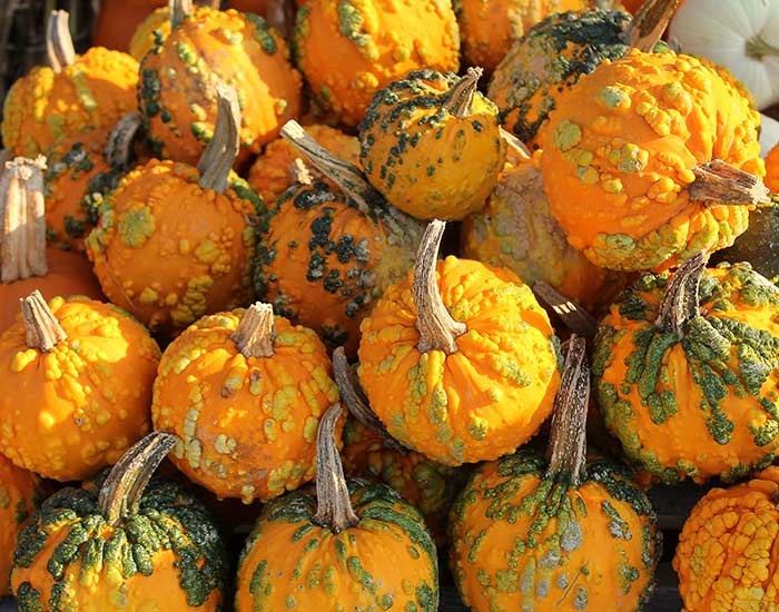
Warty Pumpkins
Alan Larkins
Chromogenic print on
Kodak Professional Endura paper
11H x 14W in
The produce stand had many warm colors of autumn with large carving pumpkins prominently displayed. Turning around, I saw these with their unusual convoluted texture.
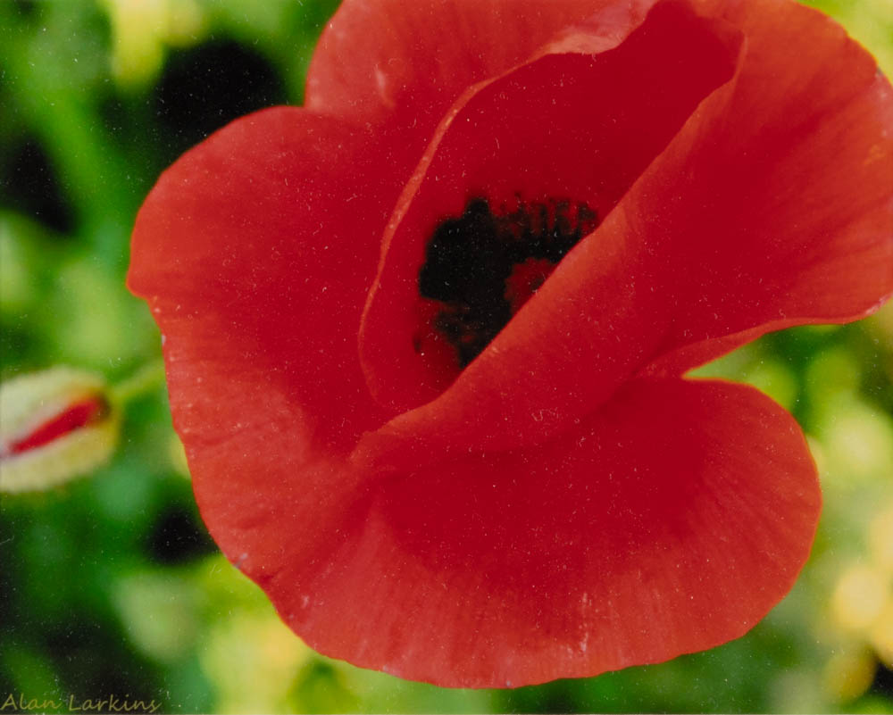
Red Field Poppy
Alan Larkins
Photograph
8H x 10W in
The striking blood-red color of these poppies, grouped in a green grassy field, would catch anybody’s eye. I wanted to try a closeup showing the center detail as well.
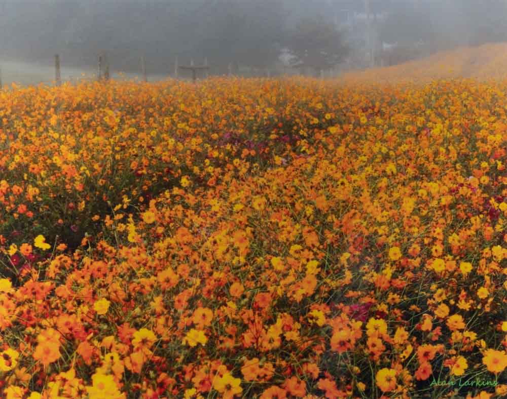
Flower Field in Morning Mist
Alan Larkins
Photograph
16H x 20W in
On a foggy fall morning, I wanted to see if the filtered light would have any effect on the view of the field of flowers near our house. I liked the blend of the orange hues with the fence fading in the background.
Threads of Antiquity
Judy Larkins
Oil, cold wax, mixed media on wood panel
24H x 16W in
Old spools of family thread and bits of lace for underneath design prints, plus recycled printed tissue paper, newspaper lettering, and Time in Bassa Vah print. Swish of a wiskbroom.
Exploring Your Way
Judy Larkins
Oil and cold wax on wood panel
10H x 10W in
In the winter and snow, it is a hard climb up but the rewards are worth the climb and beauty is all around.
Fall Birches
Judy Larkins
Oil, cold wax, mixed media on wood panel
14H x 11W in
Long hikes in the woods give you a feeling of being one with nature.
Lavender Woods
Judy Larkins
Oil and cold wax on wood panel
14H x 11W in
As I walk through mountain trails, the layering of woodland patterns are so beautiful to me.
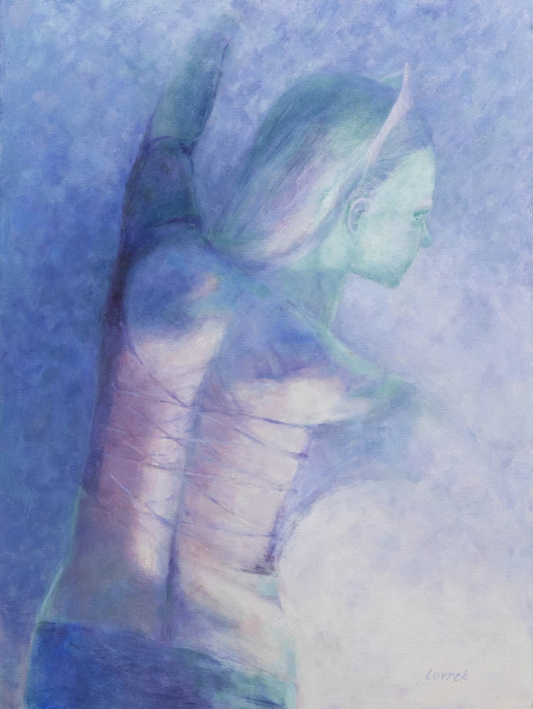
Bedazzled
Laurel Lovrek
Oil on canvas
24H x 18W in
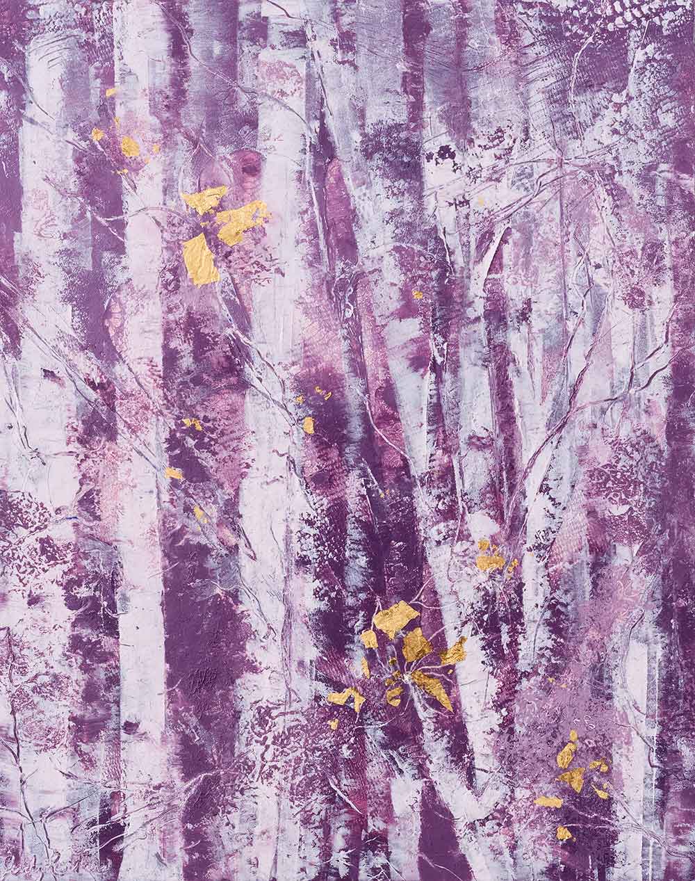
Violet – a color not quite of this world, rich yet ethereal, ideal for this female acrobat in a spotlight so dazzling, the very air disappears.
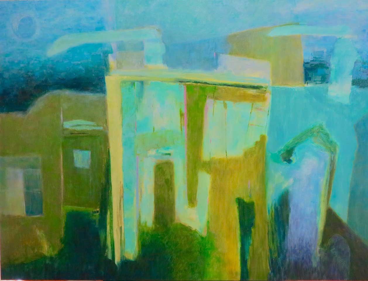
Town Nocturne
Laurel Lovrek
Oil on canvas
36H x 48W in
Green – A color of landscapes, yet useful for this town nocturne. The acid green, highlighted by magenta, are colors of the town after dark, olive in the shadows. Intended at first as a planar abstraction, developed from an urban photo, it insisted on being true to its origins.
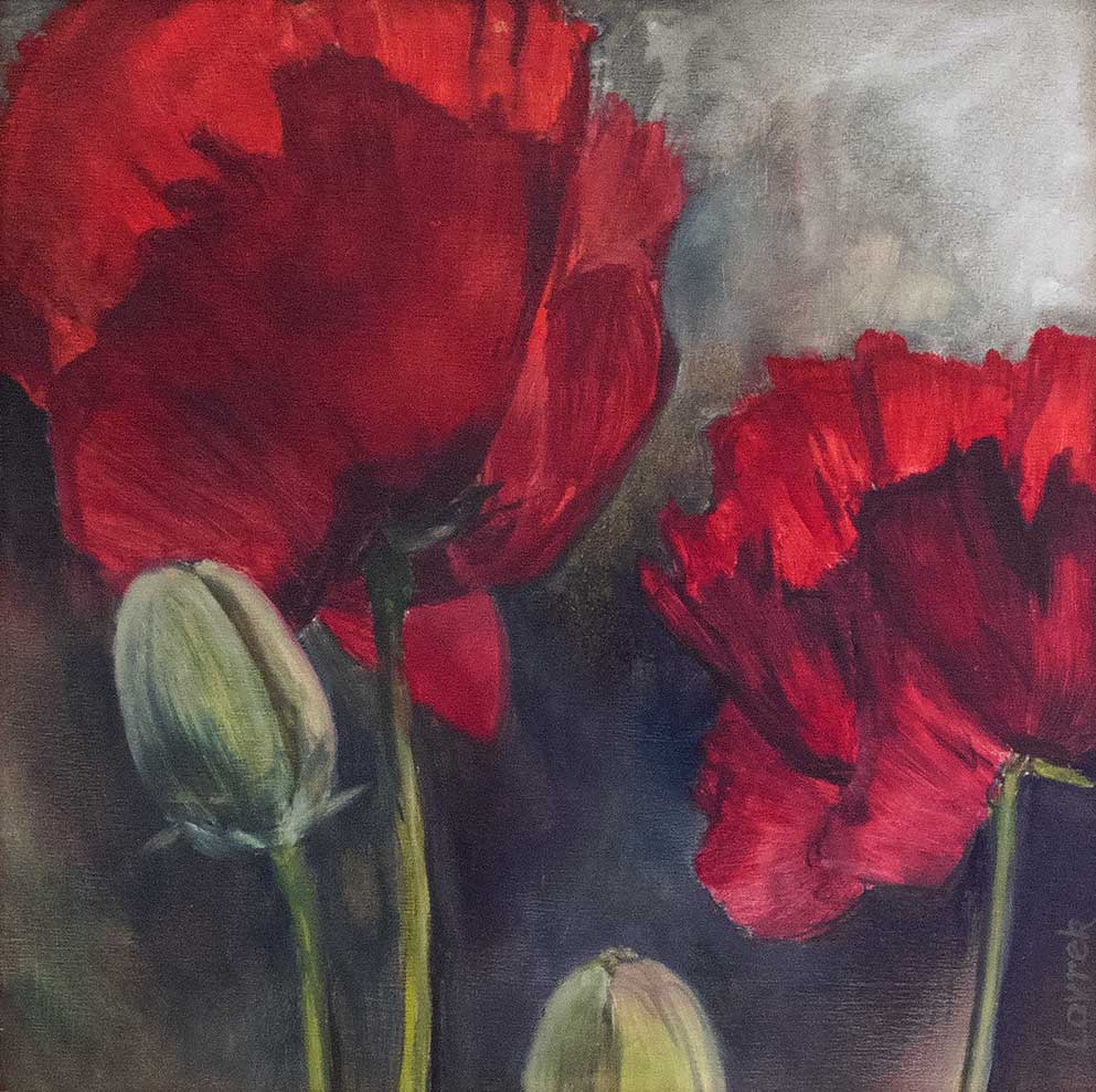
Memorial Day
Laurel Lovrek
Oil on cradled wood board
12H x 12W in
The brightest of reds, infused with orange, are the poppies in my garden. Planted on an embankment, the afternoon light can be seen through their petals. They remind me that my father left part of himself in France so long ago.
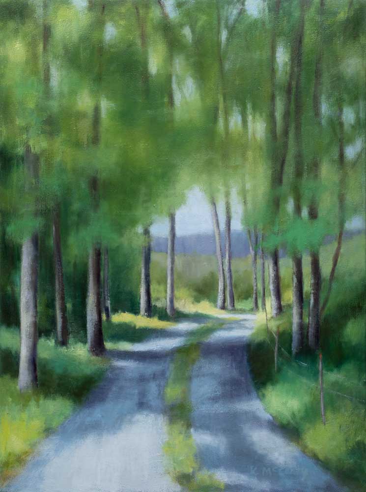
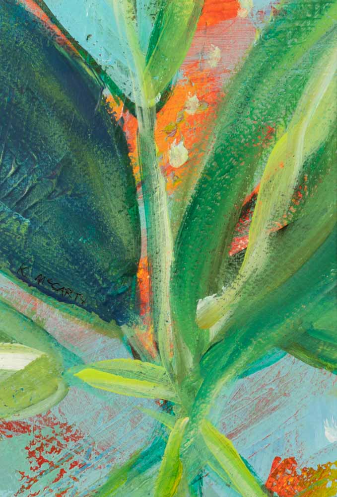
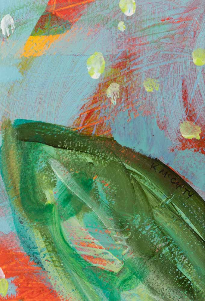
I’ll Take You There
Katherine McCarty
Oil on canvas
40H x 30W in
I like to photograph and paint peaceful out-of-the-way places in Mitchell County that invite rest for my soul. This road near the Arbuckle Community winds around farmland, old barns, and open pastures with beautiful mountain vistas. It beckons me each time I return to imagine what might be just around the curve ahead.
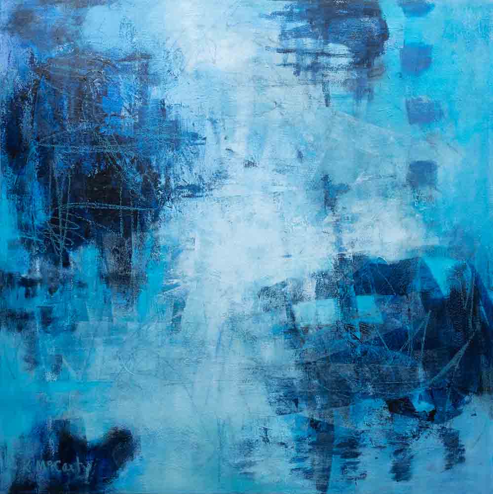
Peaceful Resolution
Katherine McCarty
Acrylic, mixed media on canvas
36H x 36W in
Intuitive, process-oriented art draws from the subconscious, allowing the expression of feelings and sensations not easily accessed by the spoken language. The color BLUE represents healing and regeneration; tranquility and sensitivity; freedom and expansiveness; inspiration and imagination.
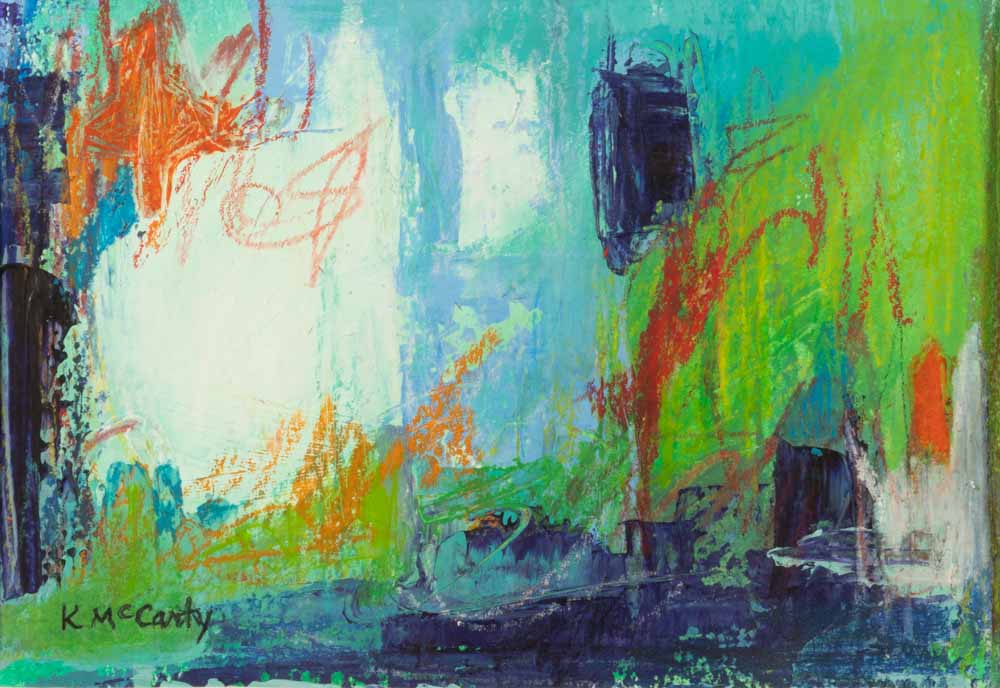
Companions
Katherine McCarty
Acrylic, mixed media on archival paper
7H x 5W in, 4H x 6W in
These studies compiled from various compositions were brought together as a compatible grouping, meant to hang vertically on a narrow wall space. They are playfully done on archival paper with markers, crayons, and acrylic paints.
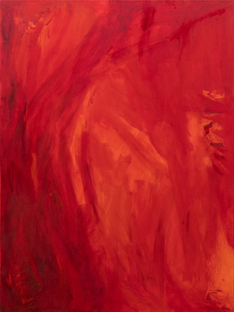
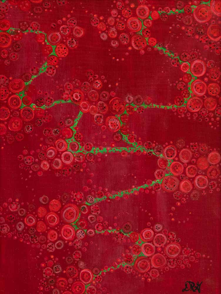
Red
Rhea Ormond
Oil on canvas
40H x 30W in
Red was inspired by painting sets for a play about Mark Rothko. After painting so many flats red, I went back to my studio and painted RED. I felt such energy and passion and at the same time a sense of peace with the color red.
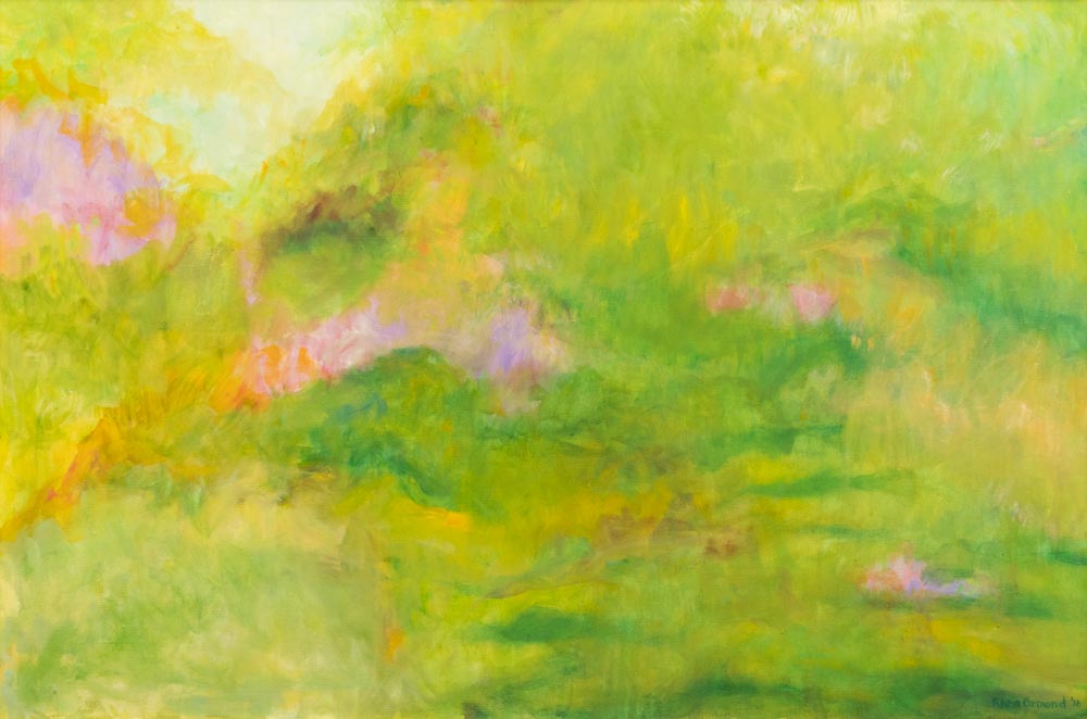
Spring
Rhea Ormond
Oil on canvas
24H x 36W in
After a long winter, when the first leaves emerge, and the world starts to turn green, one becomes exhilarated. My painting of Spring, uses many shades of green, along with soft pinks and yellows to contrast the soft greens, thus making the greens vibrant. The painting invites you in to feel the sweet smells and sounds of spring.
Cobalt
Rhea Ormond
Ground cobalt, egg tempera on birch panel
10H x 10W in
This painting uses ground cobalt with a binder of egg yolk. Egg tempera is an ancient form of painting using ground pigment into a powder and mixed with the egg which has a transparent quality. The paint is layered with many brush strokes which gives the painting depth and movement.
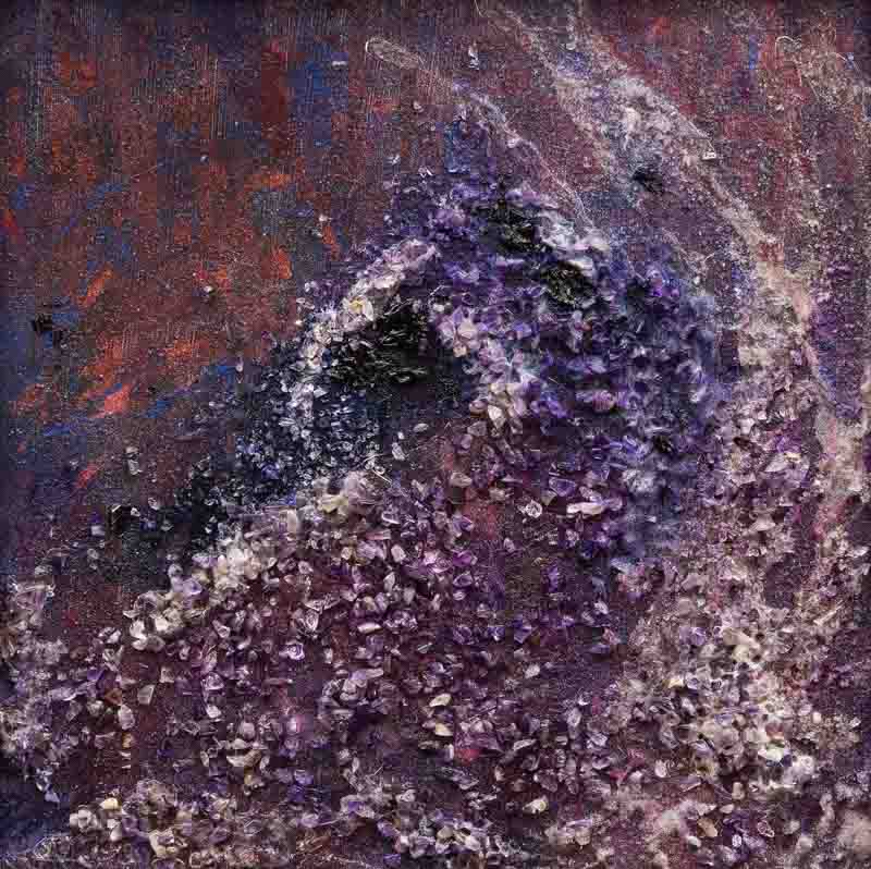
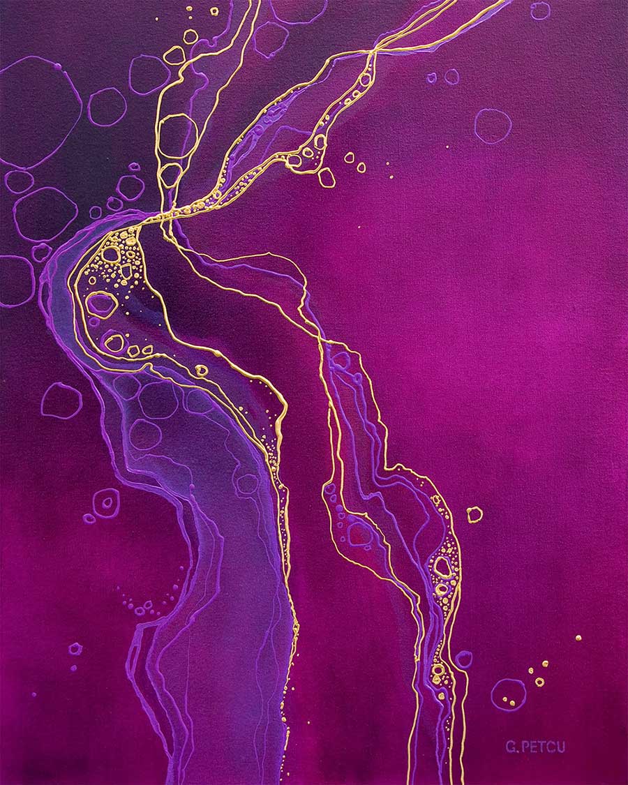
Amethyst #1
Rhea Ormond
Earth pigments, amethyst on birch panel
10H x 10W in
Amethyst has long been synonymous with Spirituality. Amethyst offers protection and is associated with crystal clear clarity and contemplation.
Amethyst #2
Rhea Ormond
Earth pigments, poke dye, amethyst on birch panel
16H x 12W in
In this painting, I have used the amethyst stones and the dye from the Poke plant to create elements of the earth.
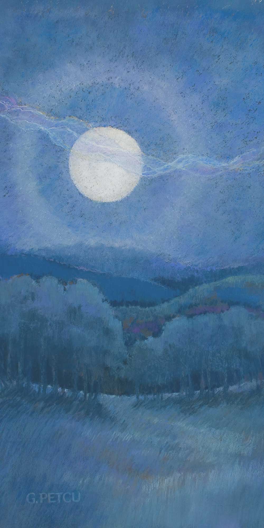
Blue Reverie
Gaylene Petcu
Pastel on panel
16H x 8W in
On warm summer evenings a quiet calm comes with the moonrise over the Blue Ridge. I chose soft pastel sticks in a limited range of blue values to depict the faint details discernible to my eye.
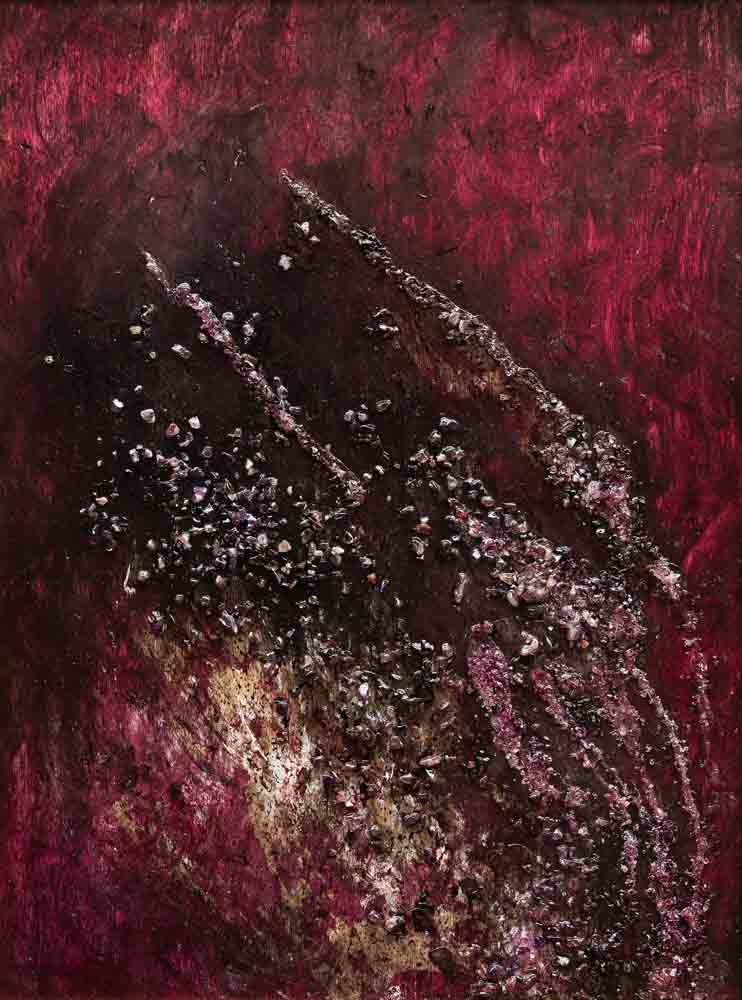
Gold Stream
Gaylene Petcu
Oil on canvas
30H x 24W in
Inspired by boulders laced with veins and fine textures, I imagined the early days of the planet when minerals and sediments were in motion, flowing and meandering until they settled down for the ages. I chose red-violet and gold to represent the intensely dynamic forces of our ever-changing earth.
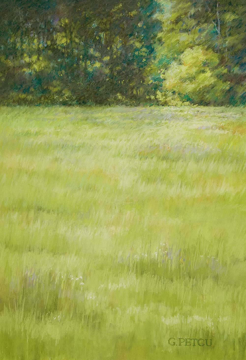
Meadow’s Edge
Gaylene Petcu
Pastel on board
19H x 13W in
Just before hay cutting time, tall field grasses mesmerize me. The longer I ponder them, the more nuances of green I see. To create texture in the grassy waves receding to the treeline, I layered many strokes of soft pastels in hues of green with touches of gold, white and lavender.
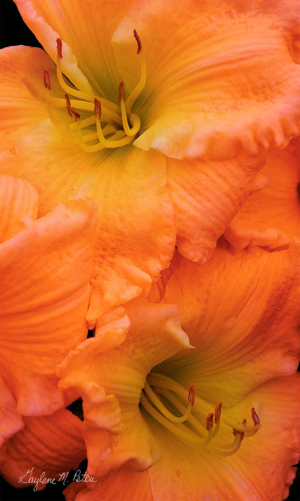
Orange Crush
Gaylene Petcu
Photograph, Inkjet print
15H x 9W in
With unbridled enthusiasm, the daylilies of mid-July burst forth in glorious color, taking on all other contenders in the garden. Each daylily bloom is a marvel. For a day.
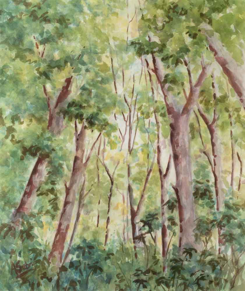
Surrounded by Trees
Anne Sabri
Watercolor on paper
27H x 22W in
‘Nature is too green and badly lighted’ Francois Boucher, C18 French painter of portraits and interior scenes. Did he ever go outside? What other color but green could ‘nature’ be, so soothing and calming with its many millions of different shades and tones. I have tried to demonstrate some of this feeling in my painting.
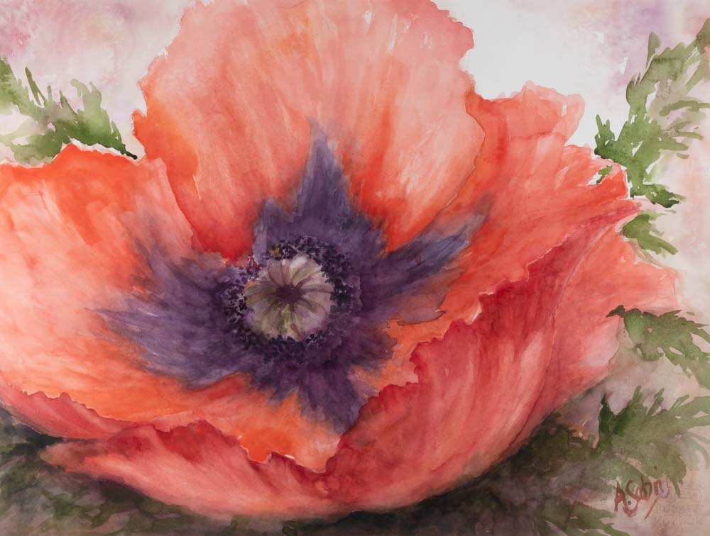
Lady in Red
Anne Sabri
Watercolor on paper
15H x 22W in
Red has never been my favorite color, so loud and shouty and lacking in subtlety. It is the color of danger, fire, anger, blood and heat. But nature as always uses it with delicacy and taste, never more so than in a poppy.
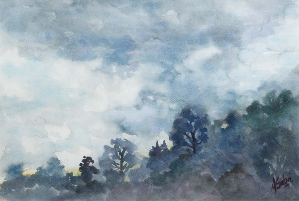
Summer Storm
Anne Sabri
Watercolor on paper
15H x 22W in
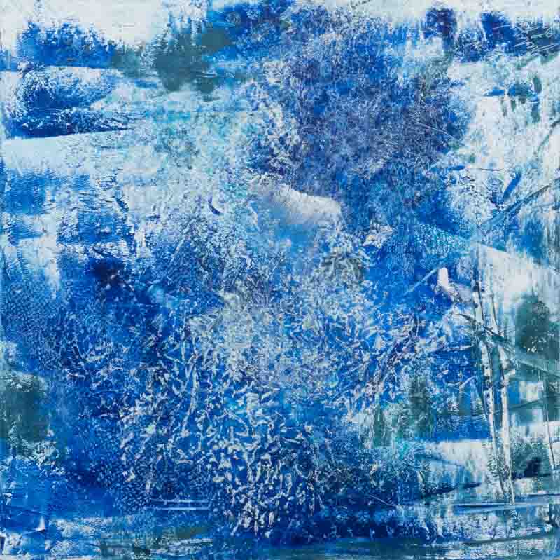
Blue, the colour of air, water, the atmosphere and receding vistas. The color of our planet. In this painting I have used its darker tones, the greys and indigos to express the menace of an approaching storm, only tiny chinks of the gentler blue of the sky are visible.
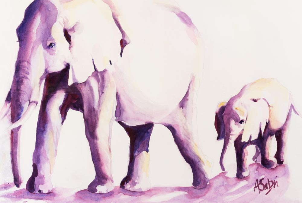
Are We Nearly There Yet?
Anne Sabri
Watercolor on paper
15H x 22W in
I love the drama of purple. Perfect for deep shadow cast by a brilliant sun, as with these elephants making their way across the parched African Serengeti. At its deepest almost black, paling to the gentlest of violets, and yet sometimes it can even stand as a neutral.
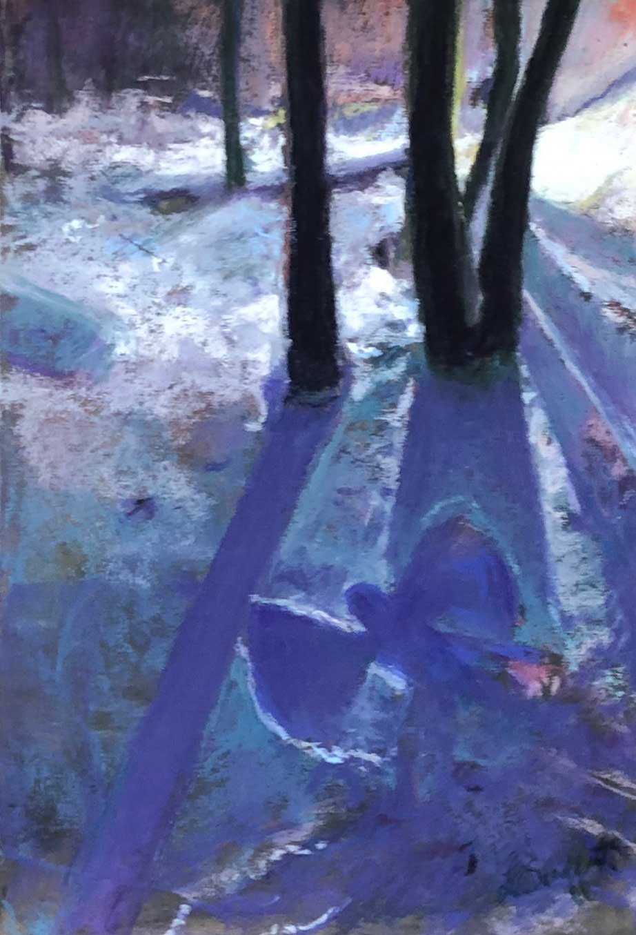
Angel at Neel’s Gap
Loretta Schaffert
Pastel on paper
11.5H x 8W in
Angel at Neel’s Gap is an original pastel painting on sanded paper. After a snowy day the evening light cast a blue-violet hue and this angel was revealed.
Orange Aura
Fredrick Shimer
Photograph
24H x 20W in
This photo was created by running electric current through an orange slice in the dark which created the aura around the orange. I then photographed the orange again with the lights on again to get the see through sections of the flesh, and the textured background. I want to capture the idea of energy flowing through an object.
Strawberry Field
Fredrick Shimer
Photograph
24H x 20W in
This photo was created by running electric current through a slice of strawberry in the dark which created the aura. I then photographed the berry with the lights on again to get the overall shape as well as the textured background. Electricity creating the lightning on the top edge of the strawberry is my favorite part of this image.
Sunny Afternoon
Fredrick Shimer
Photograph
20H x 24W in
I love the fantasy world with its possibilities and hope. I wanted to capture that idea with an image of my teenage daughter that is beginning her journey into adulthood. Inspiration for this piece came from childhood memories about the cult classic, “The Labyrinth.”
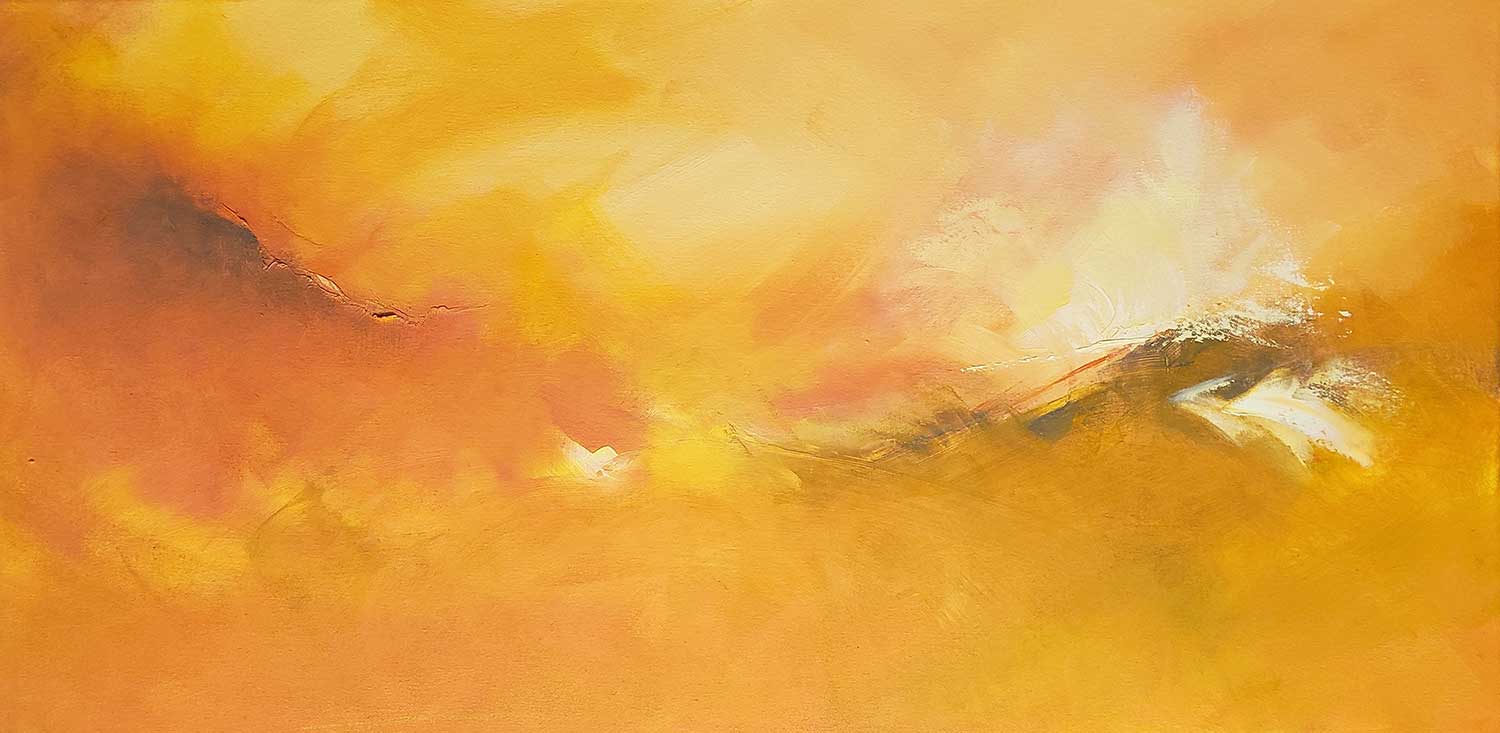
The Color of the Day
Kat Turczyn
Oil on canvas
18H x 36W in
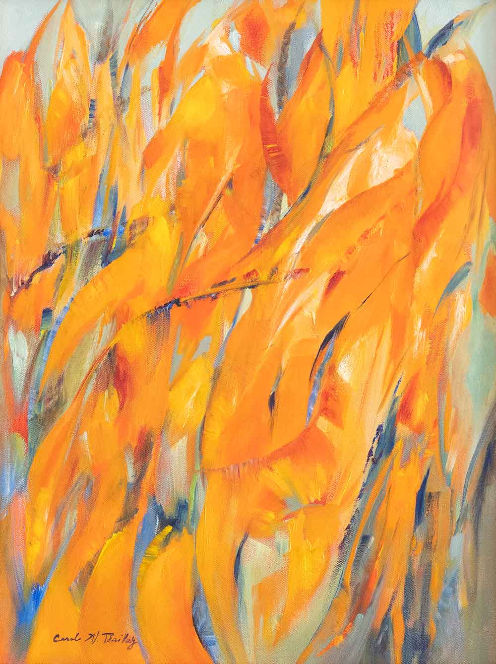
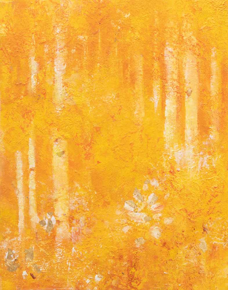
Orange, a combination of yellow and red, is one of my favorite colors. It has such energy, warmth, vitality, and joy in it! After playing with big brushes and a palette knife, I stepped back from this painting and tried to think of an appropriate name. Coming up empty, I said out loud to myself, “It’s just the color of the day,” and that became its title.
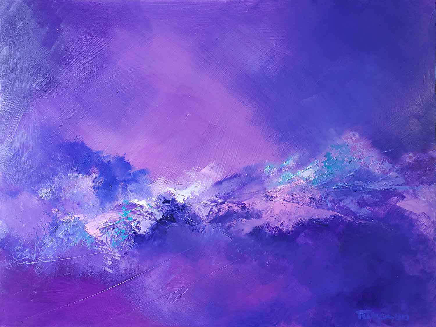
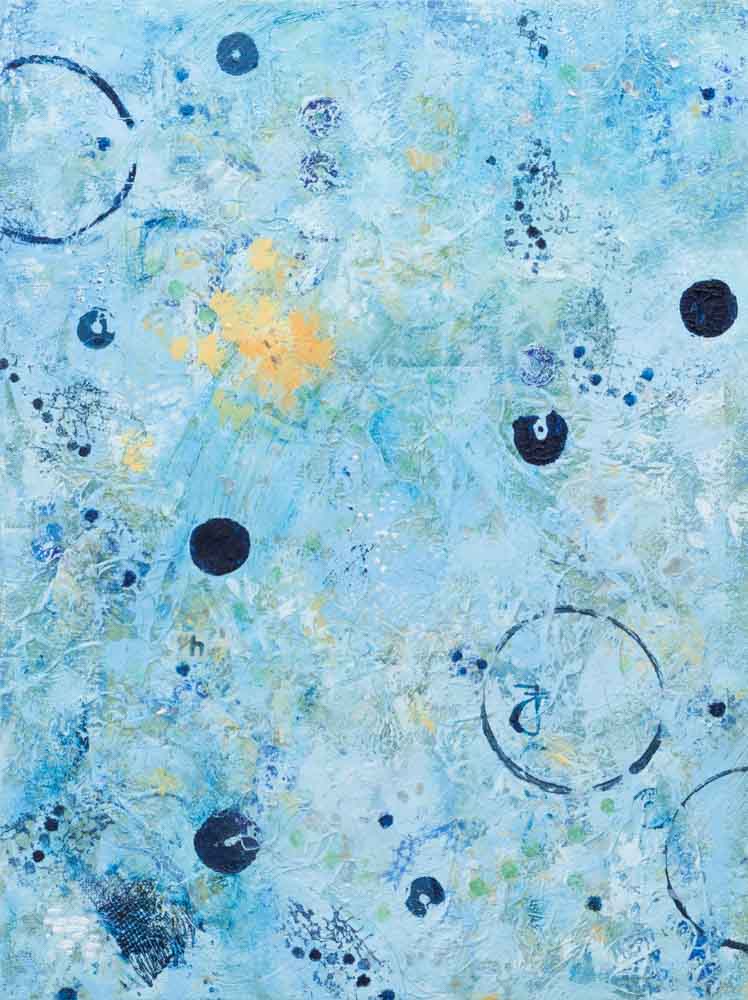
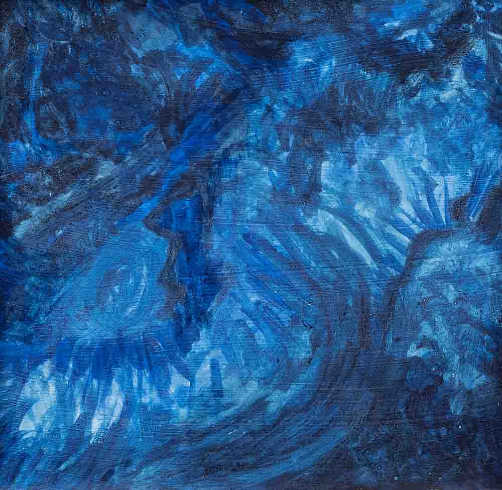
Tempest in Amethyst
Kat Turczyn
Oil on cradled board
18H x 24W in
The color violet, one of my favorite colors, inspired me to create this abstract using several shades and combinations of red and blue. This has been my year for focused but playful experimentation, and this painting, almost entirely violet, shows part of my process. I see mountains whipped by weather, but with a slight shift in viewpoint, it’s ocean waves in a storm.
Spring Sunrise
Kat Turczyn
Oil on cradled board
10H x 20W in
In the Spring, our mountains are lush with greens of every conceivable shade. It’s very fun for me to experiment with different tones of yellows and blues to arrive at a great green variety. This painting was inspired by the glorious fields wet with rainbow dew that I see every single morning about 7 months of the year.
Invited Potters
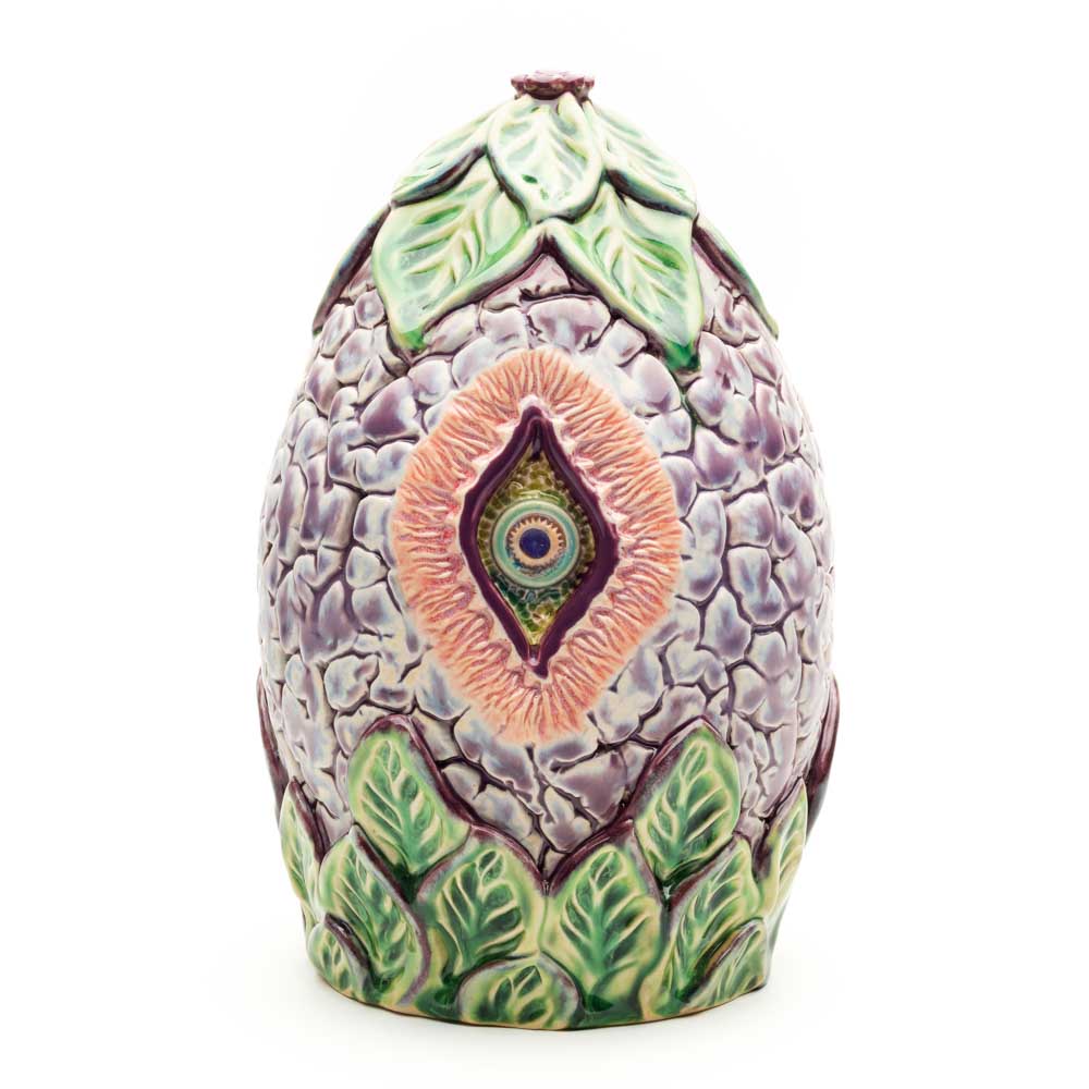
Cosmic Eye Pod Urn
Bridget Fox
Clay
The cosmic egg seed pod form symbolizes incubating birth. The all seeing eye trinity spaced around the form keeps watch over the soul of the departed and those whom they left behind.
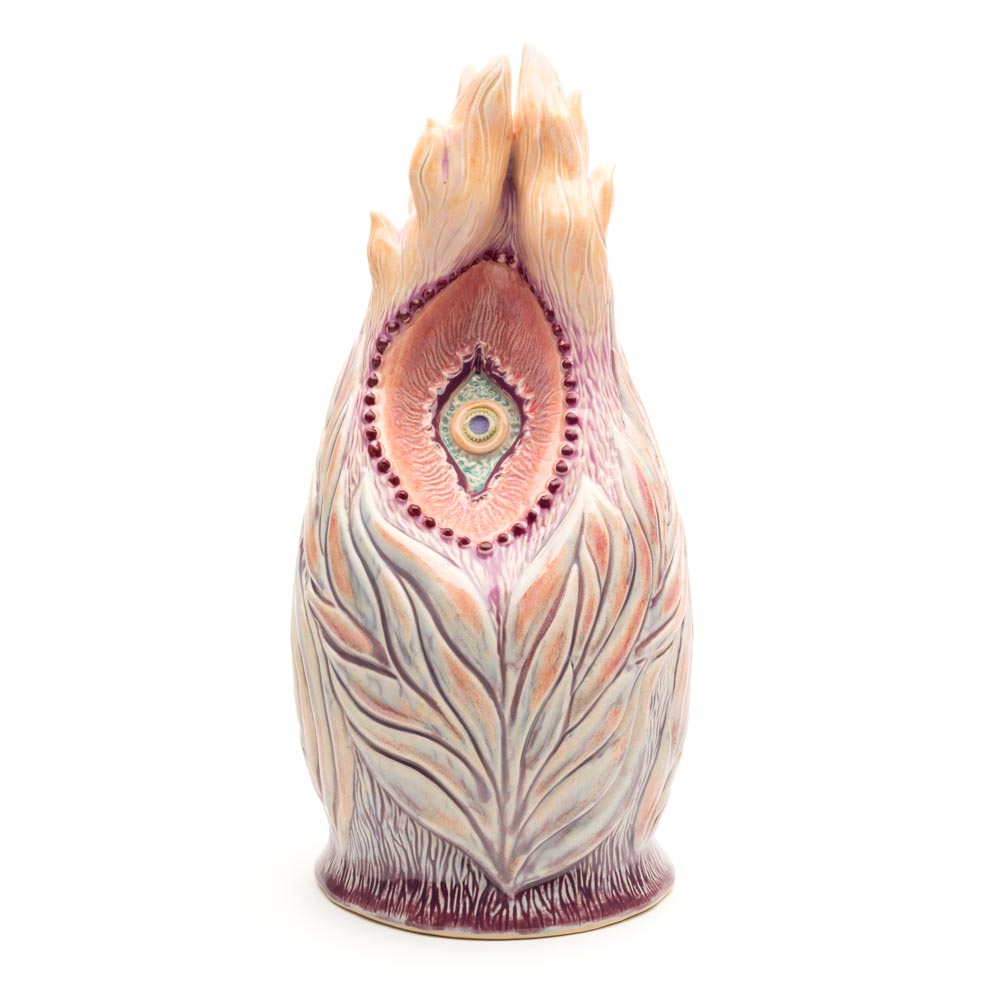
Fleather Urn
Bridget Fox
Clay
The flame of our potential representing the spark of life ignited when we are conceived. It burns forever in our soul then drifts away on the wings of our release from bodily form. An all seeing yoni eye from which we are born keeps watch. 7 feathery flames dance around it signifying complete spiritual release.
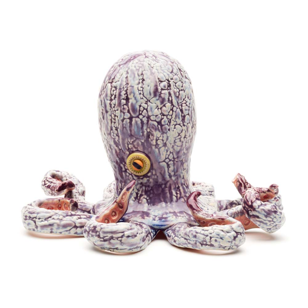
Octopus Rattle
Bridget Fox
Clay
My pandemic animal totem. Octopi are masters in adapting fluidity to change. They gracefully move through water with incredible flexibility, can squeeze themselves into tight spots, change color to match their surroundings and have 3 hearts. In making them I hope to magically be graced with their amazing adaptability to go with the flow and remain flexible with constant change.
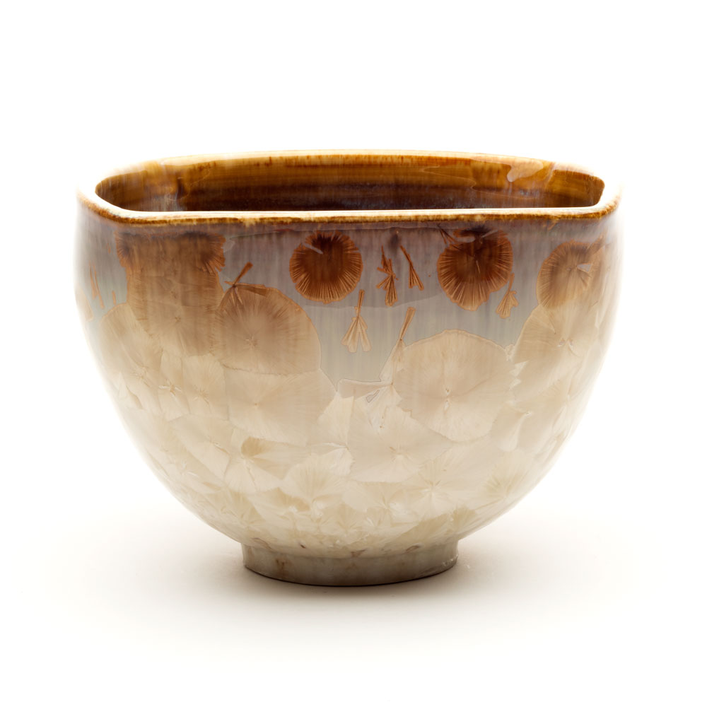
Bowl
Dennis McAvoy
Clay
This piece was formed on the potter’s wheel. It is 8.5 inches in diameter and 5 inches tall. The crystalline glaze is unusual in that once the glaze becomes fluid at above 2300 F the temperature is lowered and held at around 2100 F for several hours. During that hold time the crystals on the outside grow randomly.
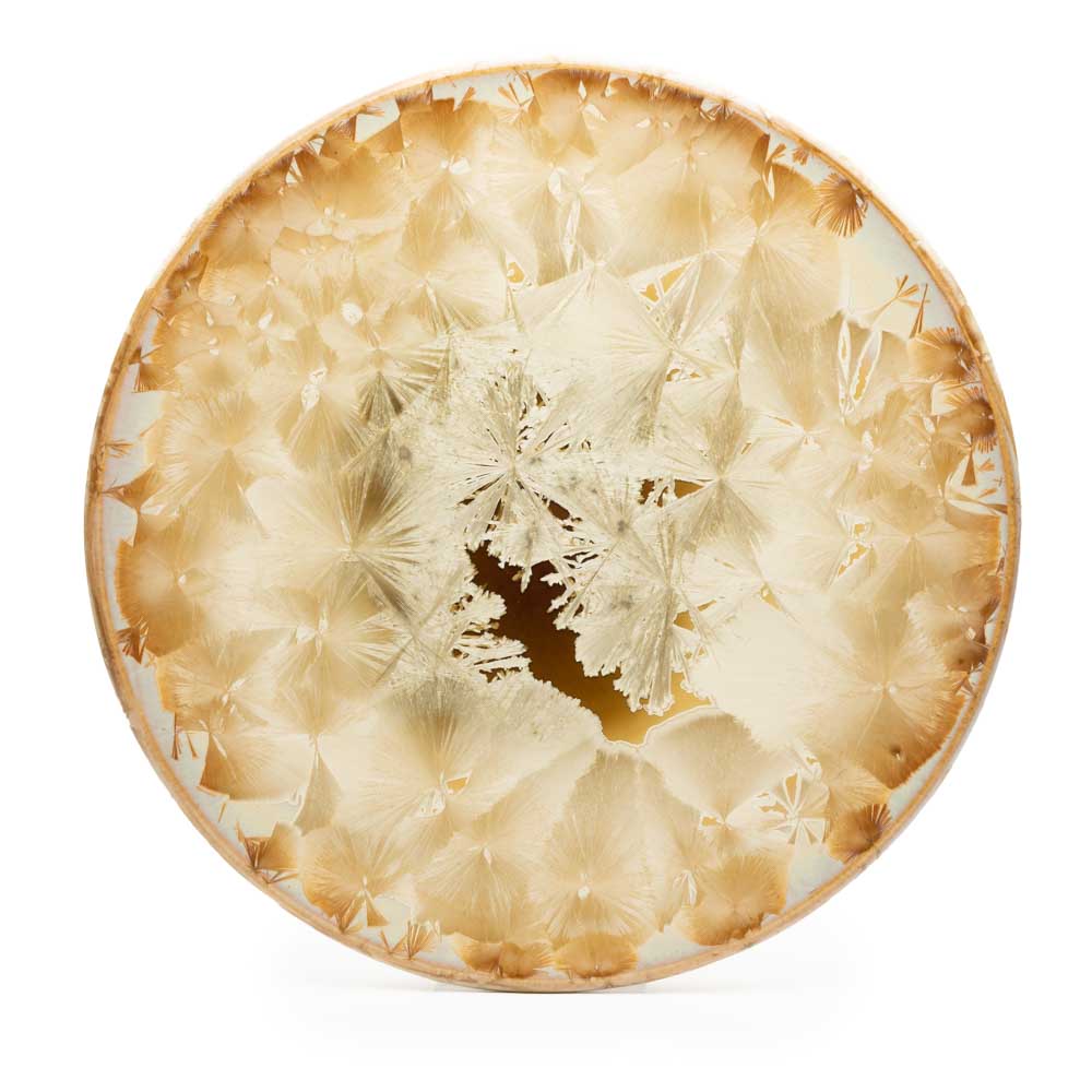
Platter
Dennis McAvoy
Clay
This hanging platter is formed from a slab of clay and then altered on the potter’s wheel. The crystalline glaze is melted at more than 2300 F. The temperature is then lowered to around 2100 F and held there several hours to allow the crystals to grow in the melted glaze. Because of the way the crystals form there is no way that any two pieces can be the same.
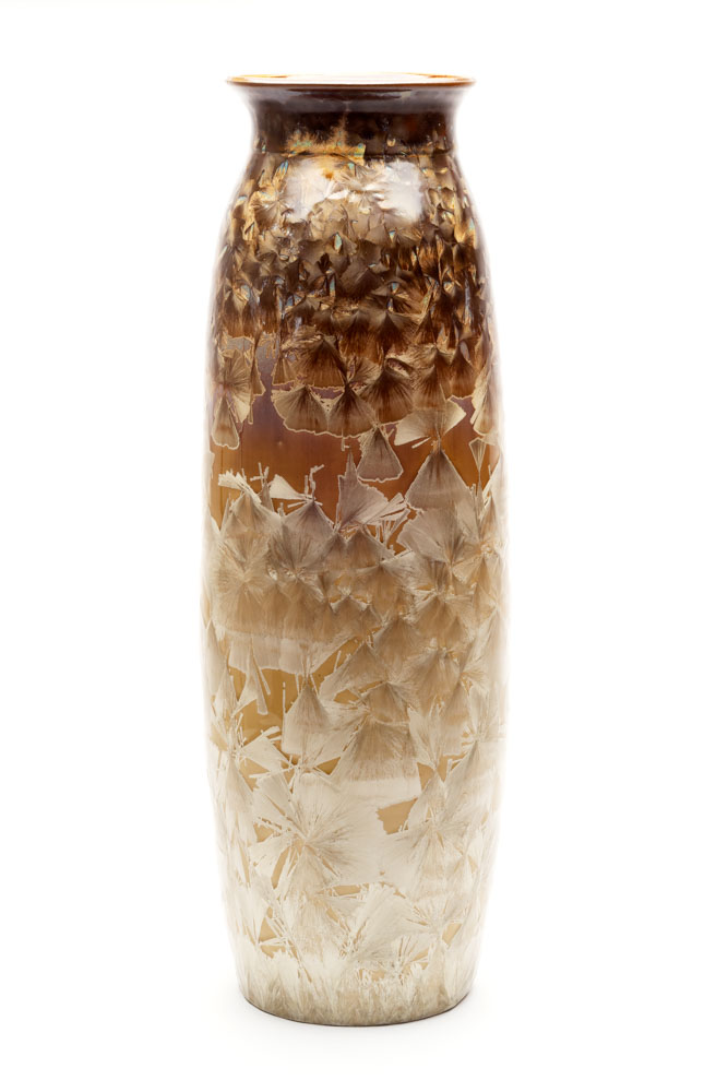
Vase
Dennis McAvoy
Clay
This was formed on the potter’s wheel as three separate parts and then joined. It is 22 inches tall and 9 inches in diameter. The crystals grow in the melted glaze while the kiln temperature is held at 2100 F for several hours. Mother Nature assures that no two pieces can ever be the same.
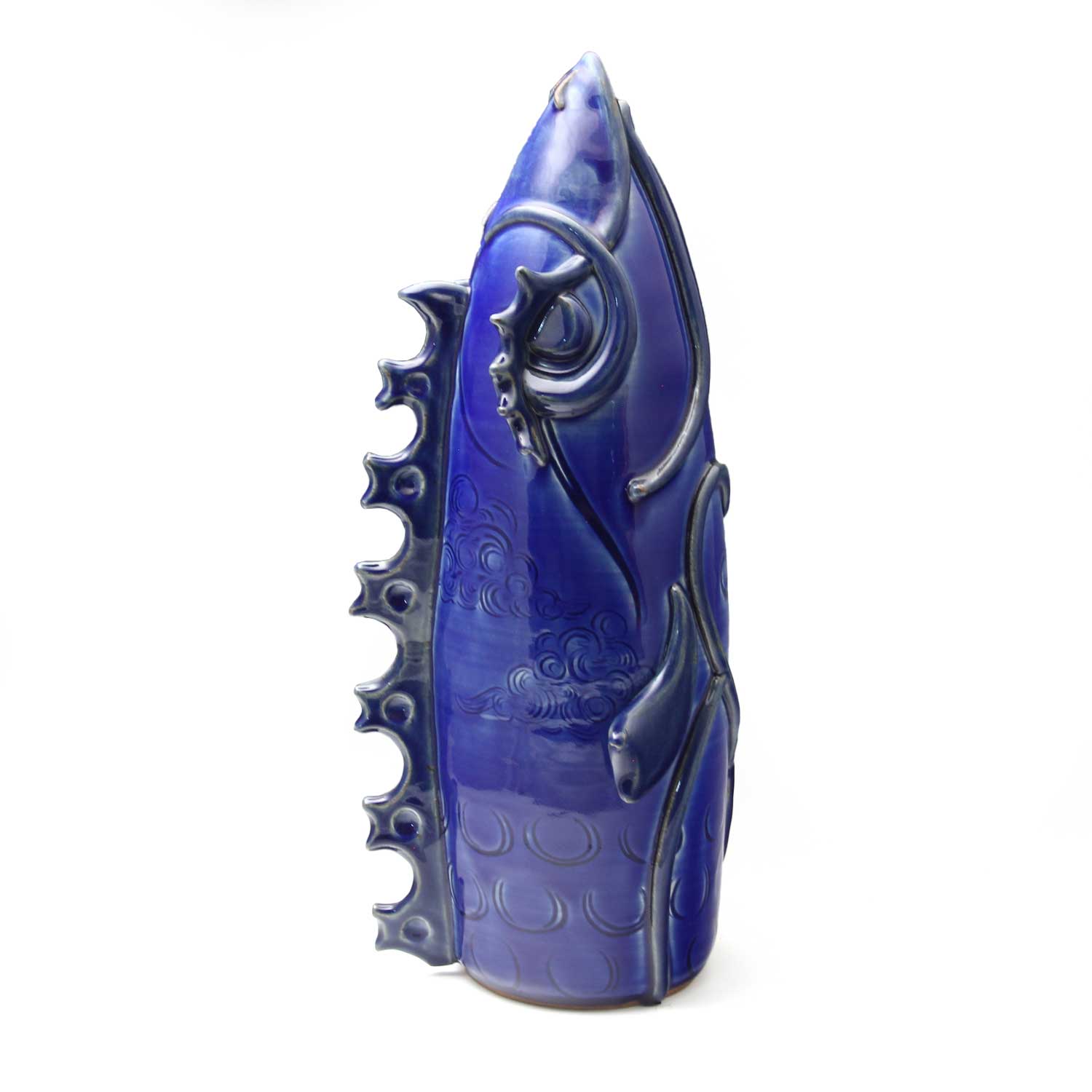
True Blue
Ruth Fischer Rutkowsky
Stoneware
The tiniest spec of cobalt leaves a trace in ceramic glaze. To pair with this powerful pigment, I begin with an upward pointing rocket-like form. Using linear elements, I depict ‘Fish’ which speaks to my heritage. Warrior-like yet heart is at the core, ‘True Blue’ is a totem for my life now; strengthened by my element, steadfast, moving upward toward truth.
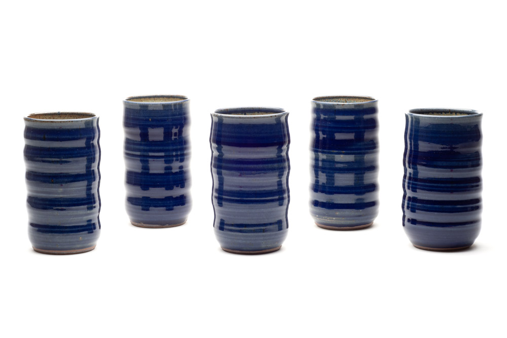
Starry Night Tumblers
Ruth Fischer Rutkowsky
Stoneware
Celebrating the dark skies of our mountain home here in WNC free from light pollution, the beautiful deep blues of twilight and emerging stars give us a sense of awe and wonder.
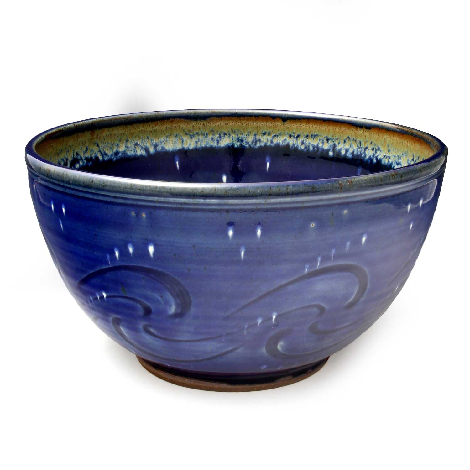
Starry Night Serving Bowl
Ruth Fischer Rutkowsky
Stoneware
Celebrating the dark skies of our mountain home here in WNC free from light pollution, the beautiful deep blues of twilight and emerging stars give us a sense of awe and wonder.
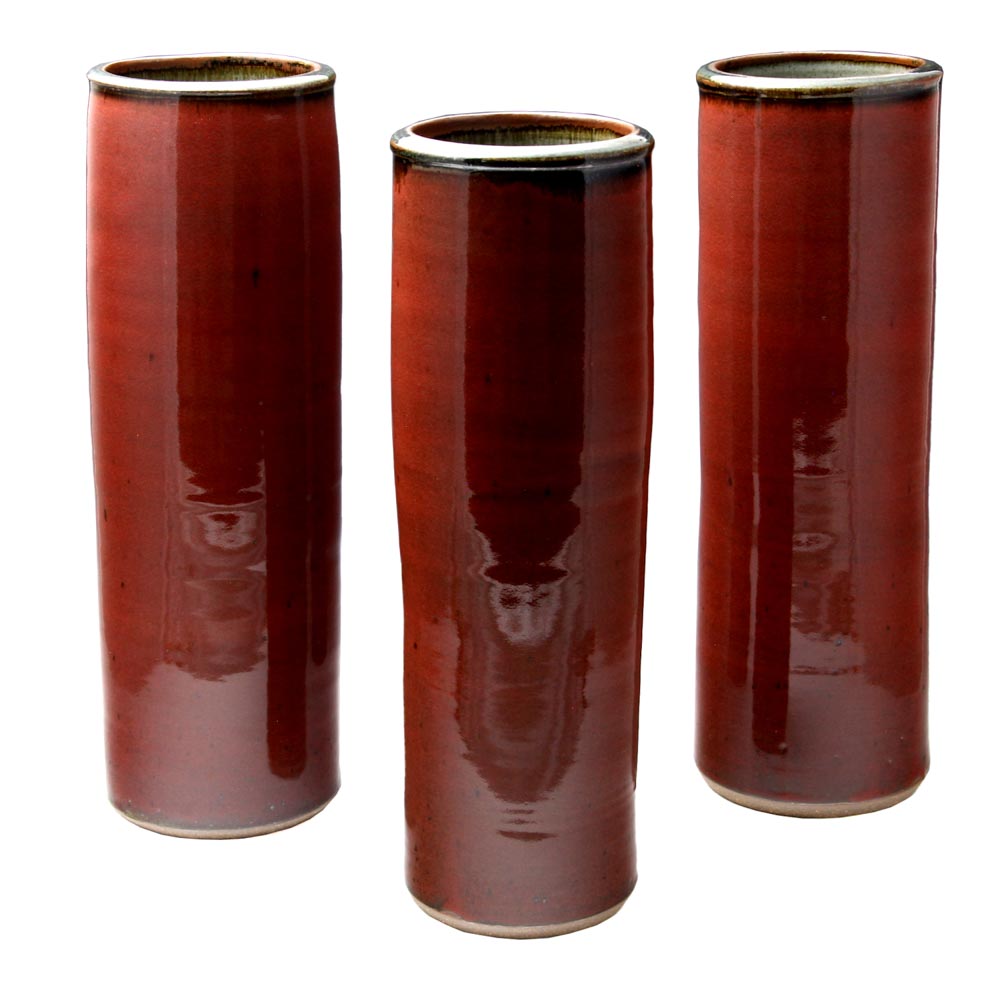
Cylindrical Trio
Michael Rutkowsky
Clay
Each 17H x 6W x 6D
I’ve chosen to represent “Red” in this work by using three wheel thrown cylindrical vessels. The consistency of form from one pot to the next one is as difficult to maintain as is maintaining the color red from one kiln firing to the next firing. I am expressing the subtle differences encountered in replicating pottery forms and colors through the process of firing to completion.
I am inviting the viewer in for closer inspection of form and color to aid in the discussion of similar vs. dissimilar characteristics of the pieces, raising the question of their perception of likeness and difference, and its relevance to the whole.
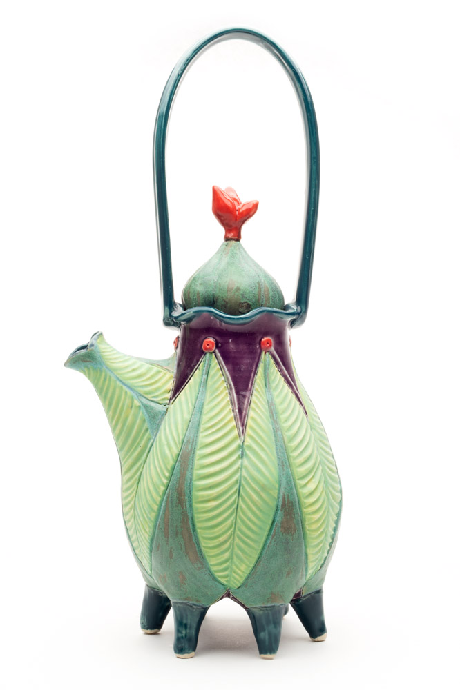
Footed Teapot
Jenny Lou Sherburne
Clay
This piece has elements of both plant (accentuated by color and texture) and animal (the use of quirky pinched feet) combined to produce an unexpectedly functional teapot. My inspirations range from the natural to the humorous, with a huge emphasis on the sheer enjoyment I have of working in clay and my love of bright and bold color.
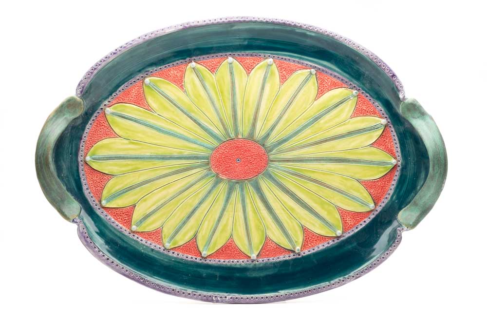
Oval Serving Tray
Jenny Lou Sherburne
Clay
In this piece I was interested in combining an almost grand sense of presentation with the static beauty of a flower. While I hope the result is elegant, the colors provide warmth and approachability. The result is decoratively functional.
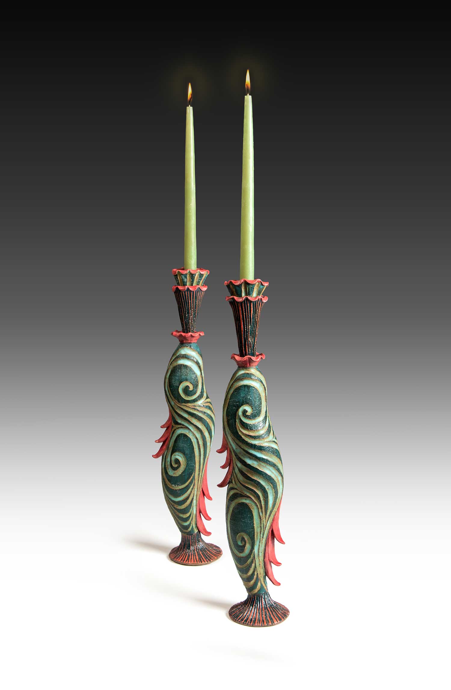
Candlestick Set
Jenny Lou Sherburne
Clay
When hand building I am more easily able to play with my love of ambiguous anthropomorphism. The lyrical movement of this piece is emphasized by the carved textures, and whether the embellishments on each side are fins or leaves, I can’t say. I have made what is in effect, functional sculpture with no small debt owed to my hero, Dr. Seuss.